Trendex
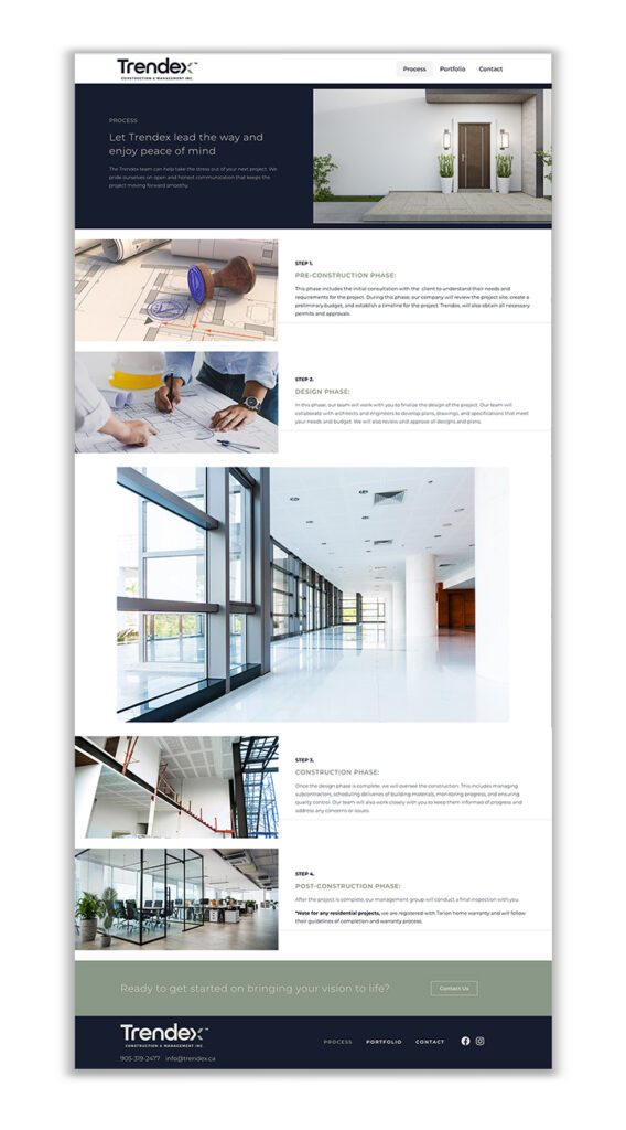
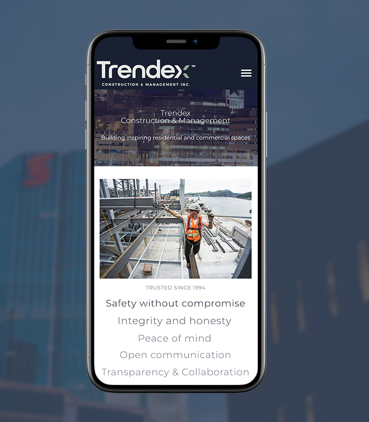
When Trendex Construction & Management approached us, they were looking to get rid of their existing outdated site in favour of something with a clean and modern design. We knew the first step to getting there was to really nail down the colours, photo treatments and fonts that would work together to create the fresh look they were hoping for.

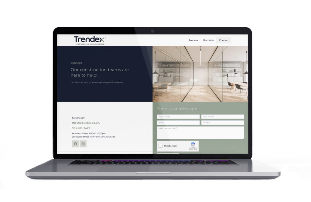
We began the project with a style guide and landed on a combination of dark blue, sage green and light gray for the colour palette. These colours, paired with ample white space and some great project photos provided by Trendex, helped to create a website that boasts attainable luxury and inspires customers to imagine the possibilities of what their own space could be.
We wanted the site to have movement, without it being too distracting, so we added in a few subtle text and photo animations to bring it to life. We also downsized the main navigation, keeping only the pages that were essential to ensure that the portfolio was what really stood out.
In the end, we created a site that serves up a big impact while at the same time being minimal in its design. If you haven’t yet checked out trendex.ca, head on over there today!


