James Campbell Insurance - a locally owned brokerage with locations in Uxbridge and Mount Albert - operated with the same logo since 1978 and wanted to refresh it but not move away entirely from the look and feel they had already.
The brief included a couple parameters to work within:
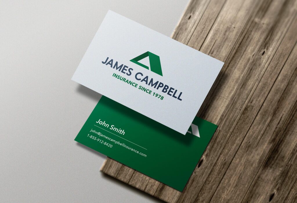
Keep the green colour in the brand
Keep the roof in some form or another
Remove a dash (-) that existed between the words “James” and “Campbell”
We decided to condense the length of the roof and partially close it in at the bottom in order to continue to convey the concept, but make it slightly more abstract. The font was replaced with a more modern (but still classic) option and the gold was replaced with a dark shade of blue.