Uxbridge Dental Suites

uxbridge-dental-suites-logo-storefront-design

Uxbridge Dental Suites

When we first met with Uxbridge Dental Suites, we were touring the shell of a former retail space that was about to be transformed into a stunning medical office.

uxbridge-dental-suites-logo-storefront-design

It was the perfect opportunity to meld the vision of the interior design with the branding for the business and we were excited to be a part of the project at this early stage.

Dr. Haddad and his team wanted the logo to have a nod to the Uxbridge area without going into a full-on “Trail Capital” theme which felt overdone lately by other health practitioners. The space would be super modern and sleek so the logo needed to reflect that but also not deter a potential client who might mistake this for inexperience in the field.

The final logo has a subtle reference to the nearby trails with the leaf motif, but the lines within the leaf also reflect the wood feature wall you see as soon as you enter the reception area.

It was a pleasure to work with Dr. Haddad and his team and we are excited to see the final design come together when the office opens to the public this month.
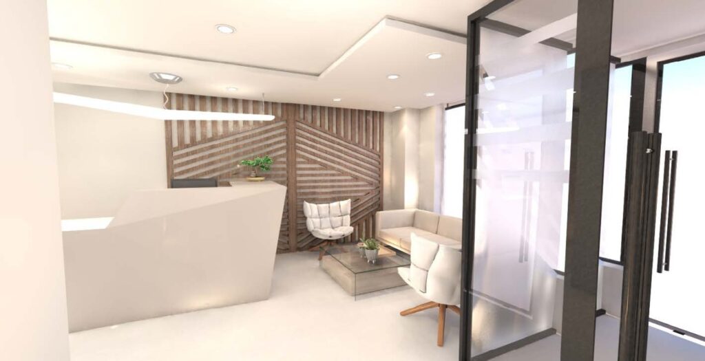
uxbridge-dental-suites-interior-design
RENDERING OF RECEPTION INTERIOR
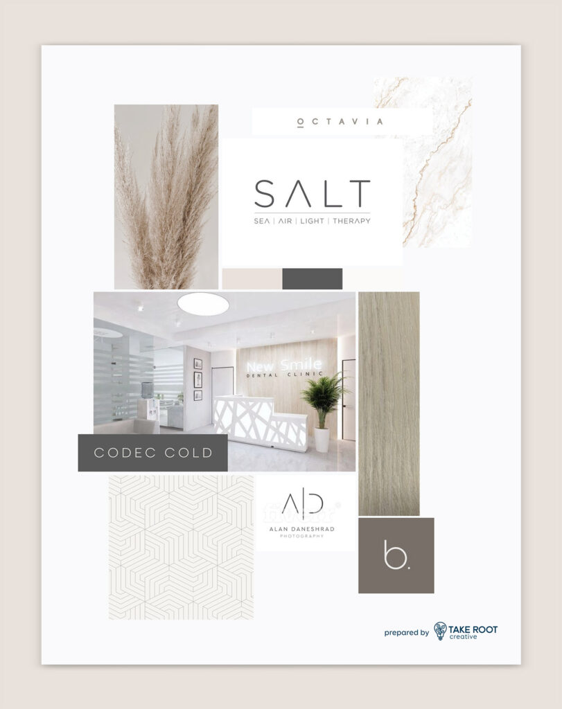
uxbridge-dental-suites-moodboard-design
MOODBOARD/INSPIRATION
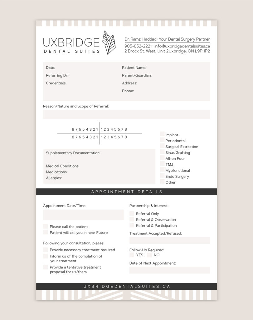
uxbridge-dental-suites-notepad-design
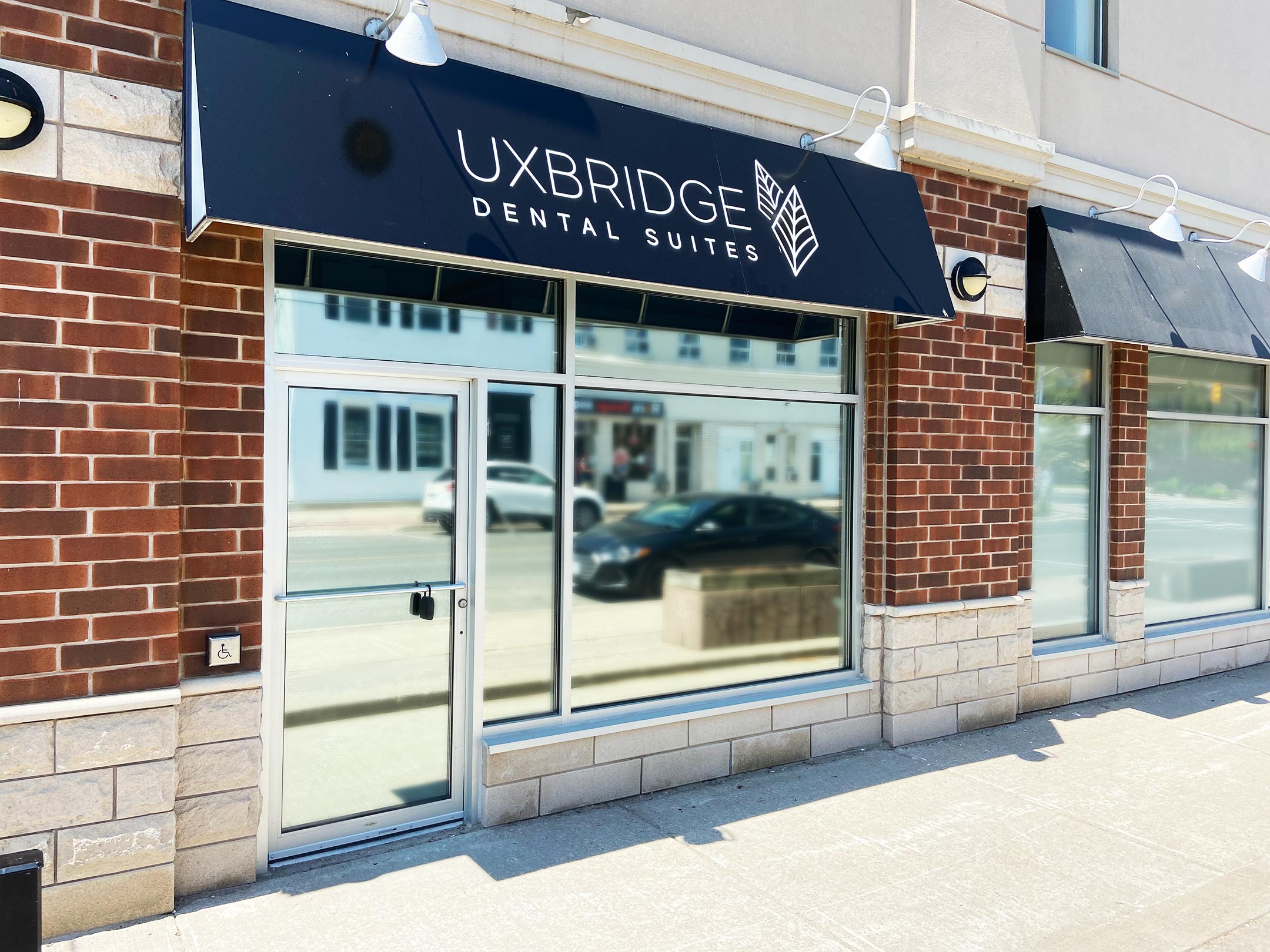
uxbridge-dental-suites-logo-window-design
uxbridge-dental-suites-buisnes-card-design

Main Street Pools

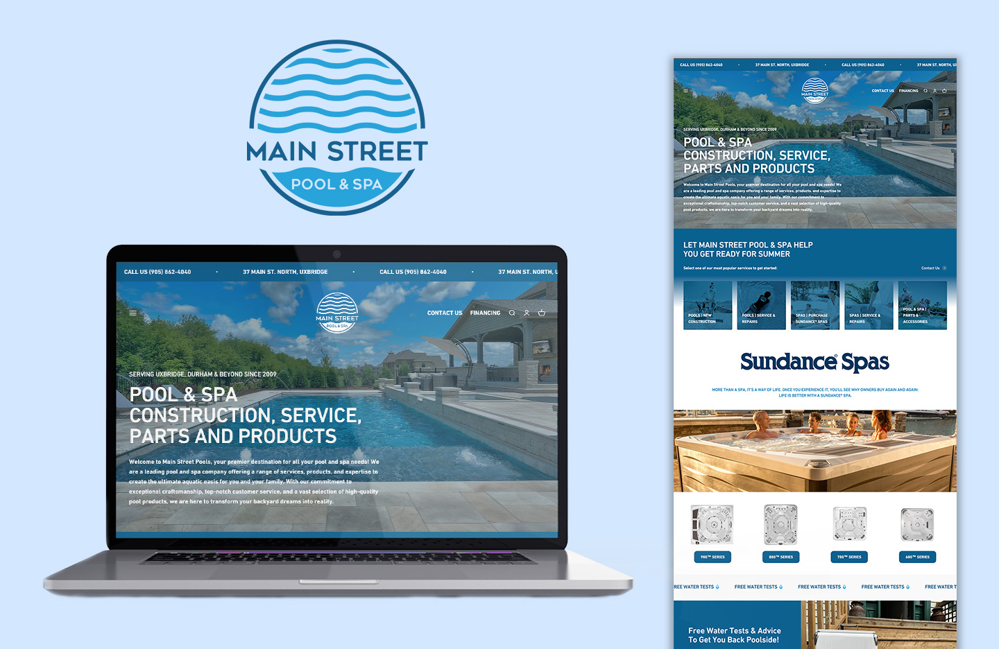
main-street-pools-laptop-home-page-website-design

As Shopify continues to develop better tools for creating stronger website design, we are seeing more and more clients ditch their static site in favour of one platform to manage everything. Main Street Pools began with Shopify as a POS, added an commerce site and have now left their WordPress platform behind in favour of managing everything from one place.
Continue reading

Gary Kent Golf

gary-kent-golf-laptop-home-page-website-design

Gary Kent and his golf school are highly regarded throughout the GTA.
Back in 2016, Gary was looking to update his site so we switched from an html-based site over the Wordpress.

Continue reading

Drive Festival

drive-fest-laptop-home-page-website-design

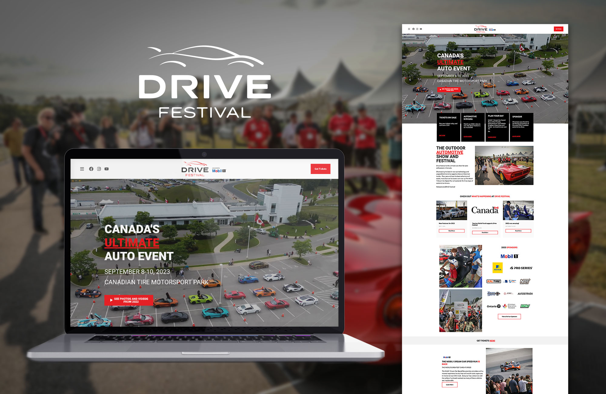
Drive Festival is the ultimate show for auto enthusiasts, providing the opportunity to see (and hear) the best collection of exotic, manufacturer and classic cars. This isn’t your typical car show, it’s three days of automotive nirvana.

Continue reading

James Campbell Insurance

James Campbell Insurance

James Campbell Insurance - a locally owned brokerage with locations in Uxbridge and Mount Albert - operated with the same logo since 1978 and wanted to refresh it but not move away entirely from the look and feel they had already.

The brief included a couple parameters to work within:

  • Keep the green colour in the brand

  • Keep the roof in some form or another

  • Remove a dash (-) that existed between the words “James” and “Campbell”

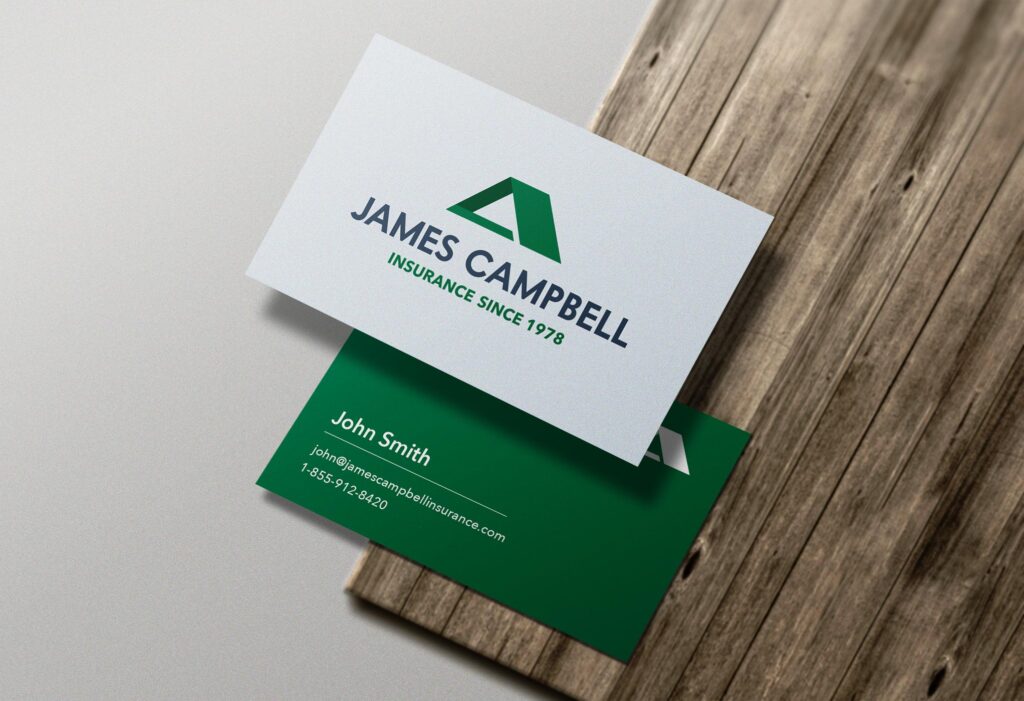
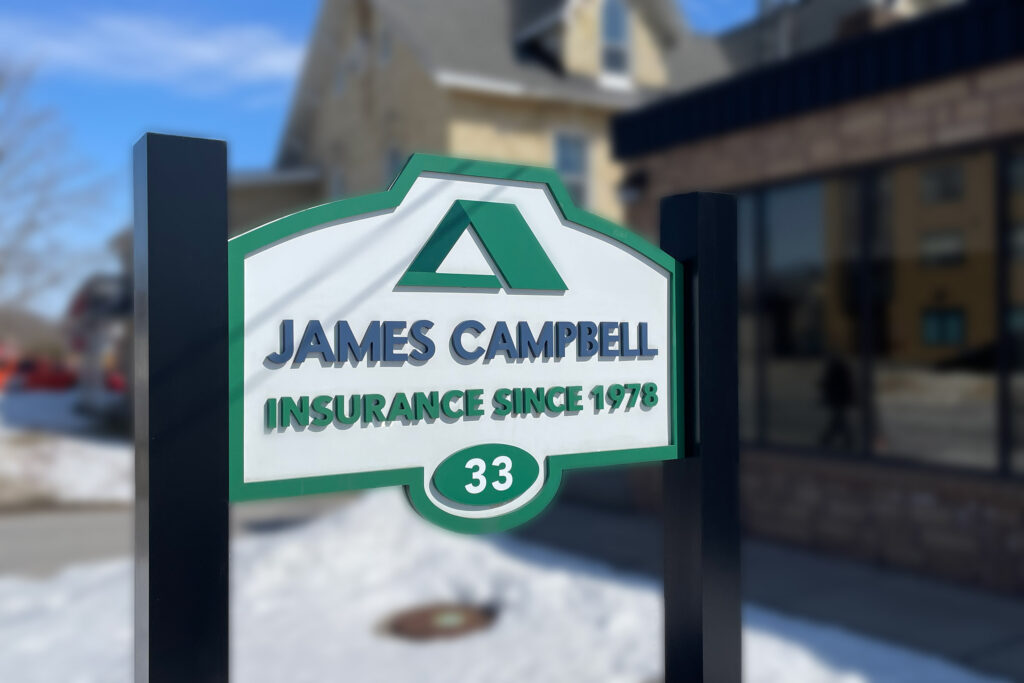
We decided to condense the length of the roof and partially close it in at the bottom in order to continue to convey the concept, but make it slightly more abstract. The font was replaced with a more modern (but still classic) option and the gold was replaced with a dark shade of blue.

james-cambell-insurance-old-logo-new-logo-design
james-cambell-insurance-business-cards-design
james-cambell-insurance-laptop-website-design
james-cambell-insurance-outdoor-sign-logo-design

Techstar

techstar-laptop-home-page-website-design

Techstar Plastics

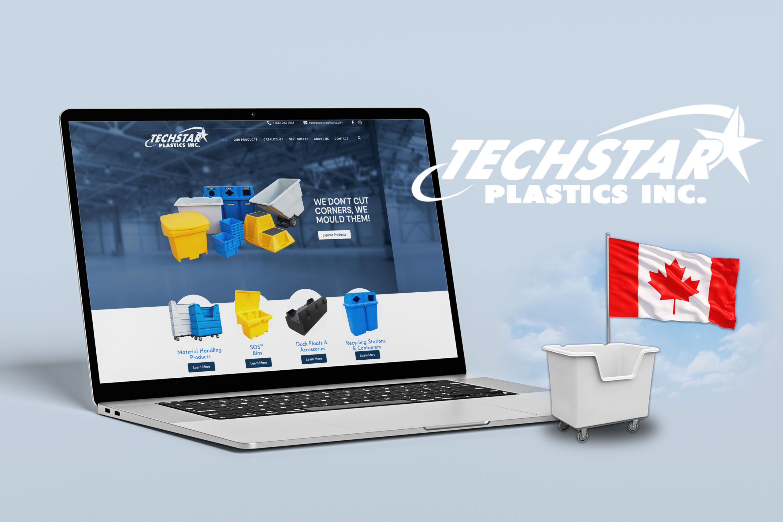
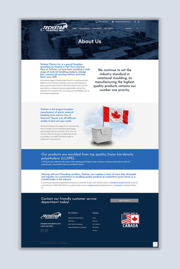
Just down the road in Port Perry, our friends at Techstar have been moulding a wide range of material handling products, storage bins, commercial recycling stations and dock floats since 1978.

techstar-laptop-home-page-website-design

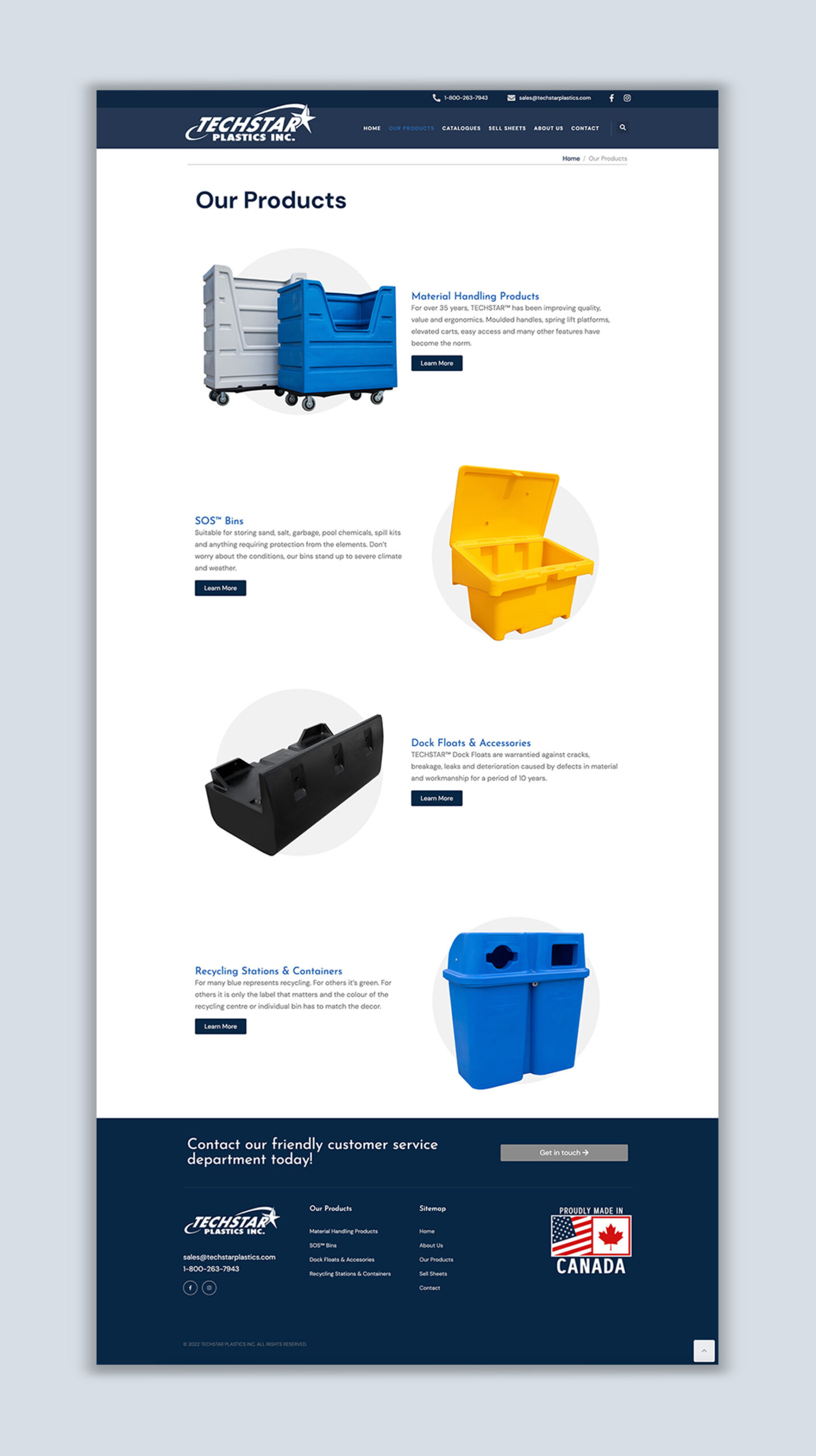
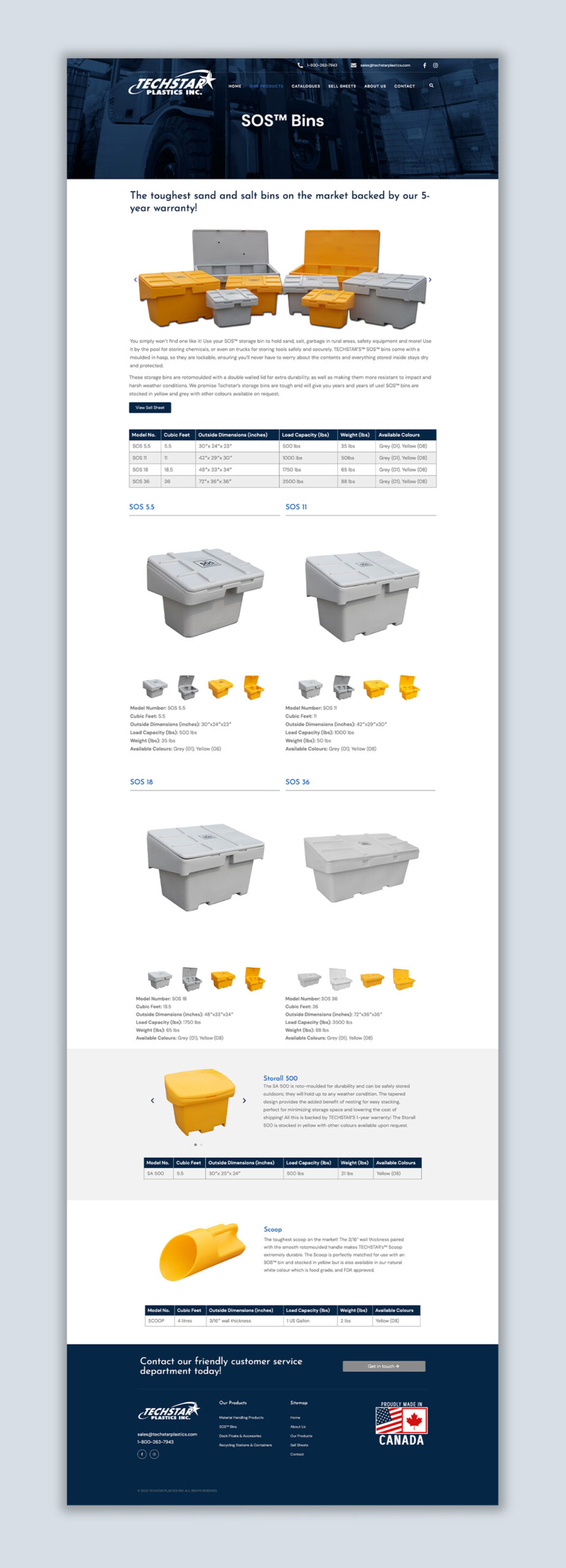
Techstar came to us hoping to improve the look and user experience of their website and ensure that information about their products was easy for customers to find. The most intricate part of the site build was deciding how to lay out product categories and the product pages themselves. We wanted to ensure that the product pages had good flow and displayed everything customers need to know without being too cluttered. We achieved this thanks to excellent product photos from Techstar and trying out a few different layouts along the way.

The simple colour palette, clean lines and buttons, generous use of white space and oversized page titles create a professional and sharp-looking website that both Take Root Creative and Techstar Plastics can be proud of!

techstar-home-page-website-design
techstar-about-page-website-design
techstar-sos-bins-product-page-website-design

The Curators Style Co.

web-design-uxbridge

The Curators Style Co.

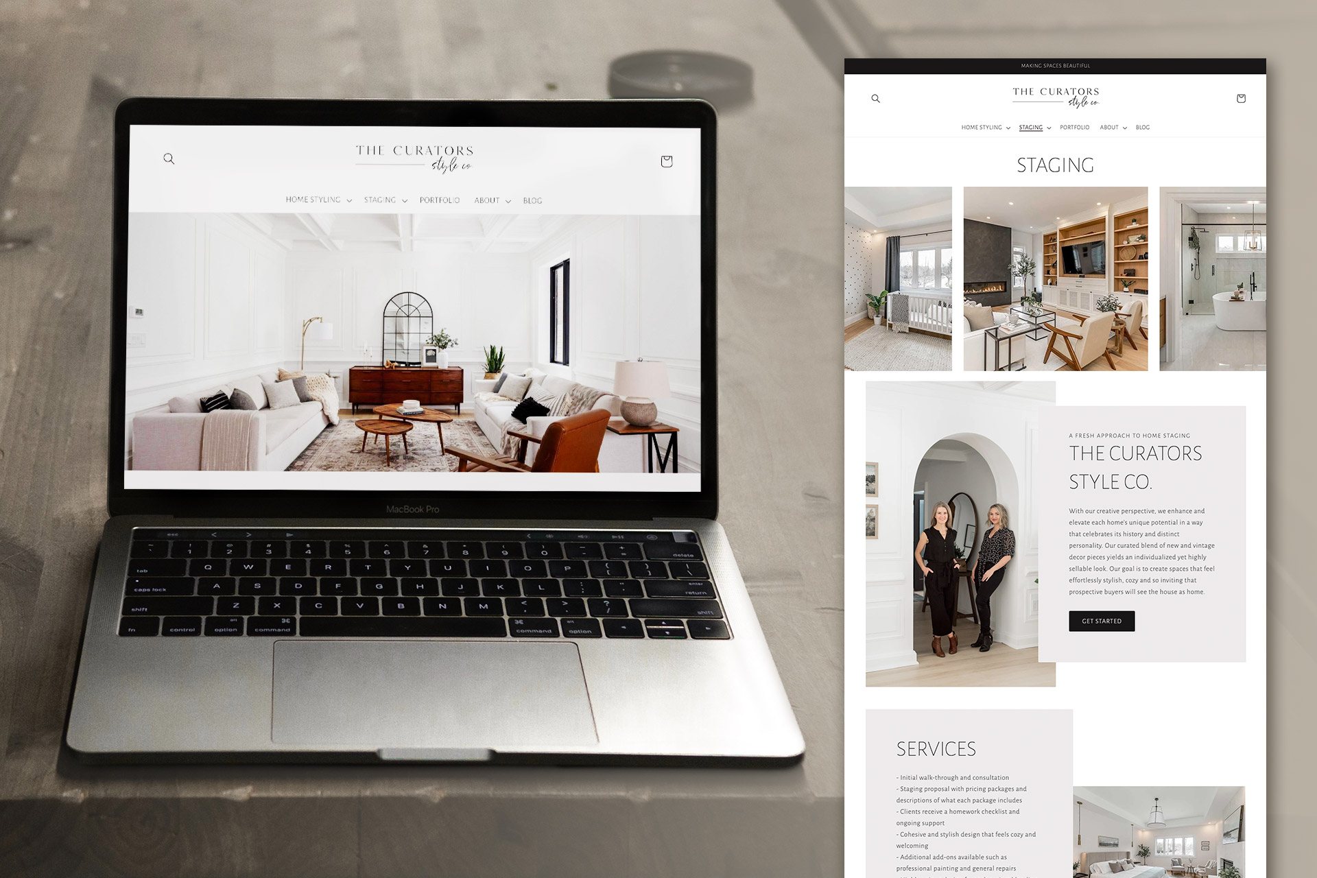
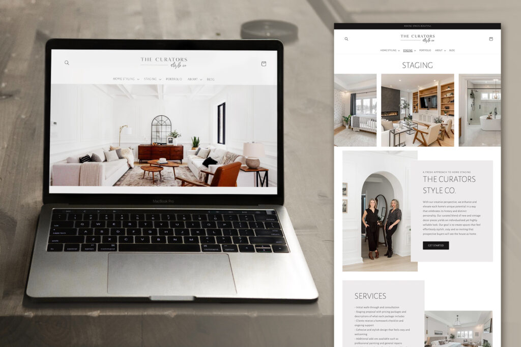
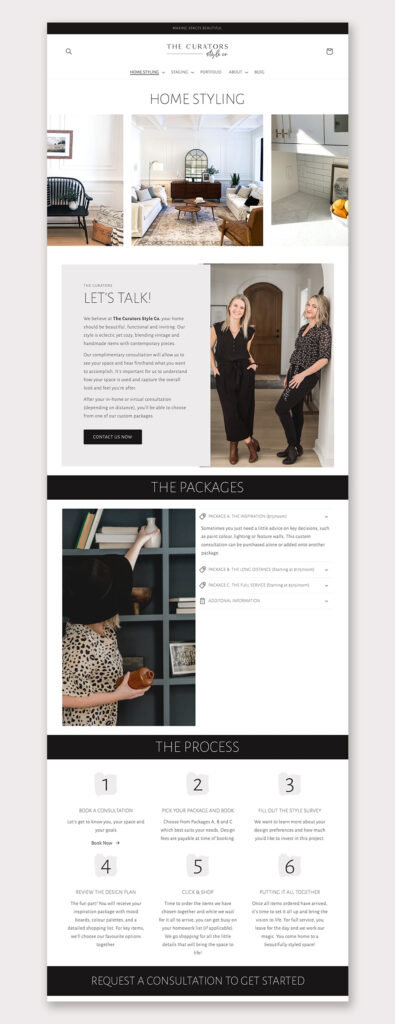
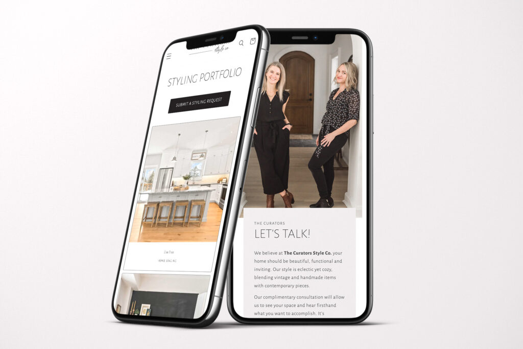
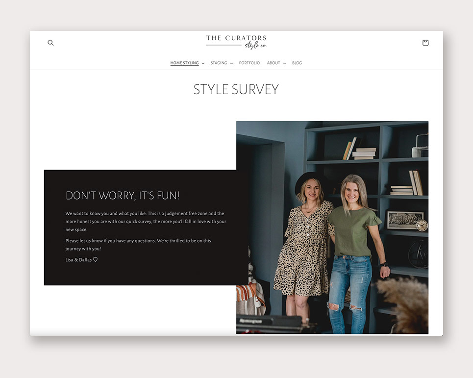
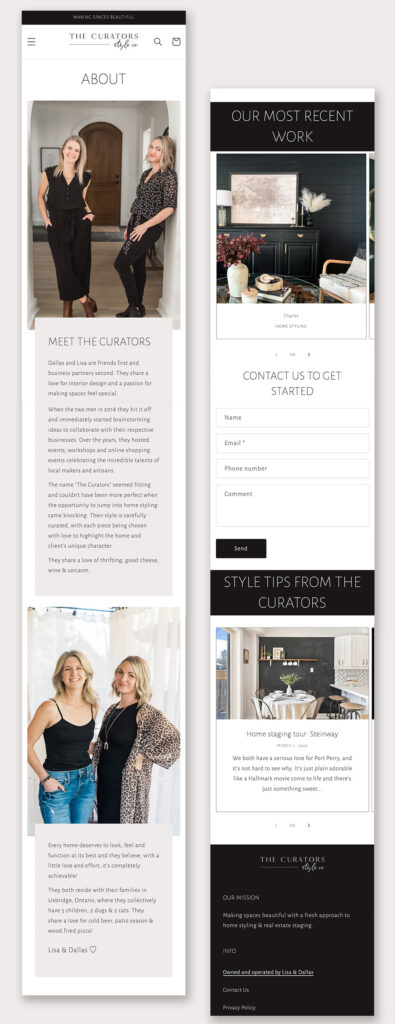
Lisa and Dallas, the team behind The Curators Style Co., required a hybrid site that allowed them to display their staging and interior design portfolio along with an e-commerce shop to sell off staging pieces when required. We utilized the Shopify platform to neatly bring these two goals together.

web-design-uxbridge-2

Shopify has grown substantially from their early days of a strictly e-commerce platform to the digital marketing juggernaut is it today. The site structure now allows for stronger design on static content pages and the extra built-in tools for email newsletters and customer management make it a no brainer for many businesses.

The Curators Style Co website uses a monochromatic colour scheme in order to put the emphasis on the beautiful photographs that showcase their primary services. Built in forms capture information from potential leads and allow staging requests to be quickly received and managed.

The store can quickly be toggled live when needed and sales can be managed through the same website dashboard to allow for a simple streamlined process. Contact us to learn more about how Shopify can work for your business.

best-web-design-uxbridge-1
best-web-design-uxbridge
top-web-design-uxbridge
best-website-design-uxbridge

Bridge the Gap by the Township of Uxbridge

bridge-the-gap-magazine-cover-article-design

Bridge the Gap by the Township of Uxbridge

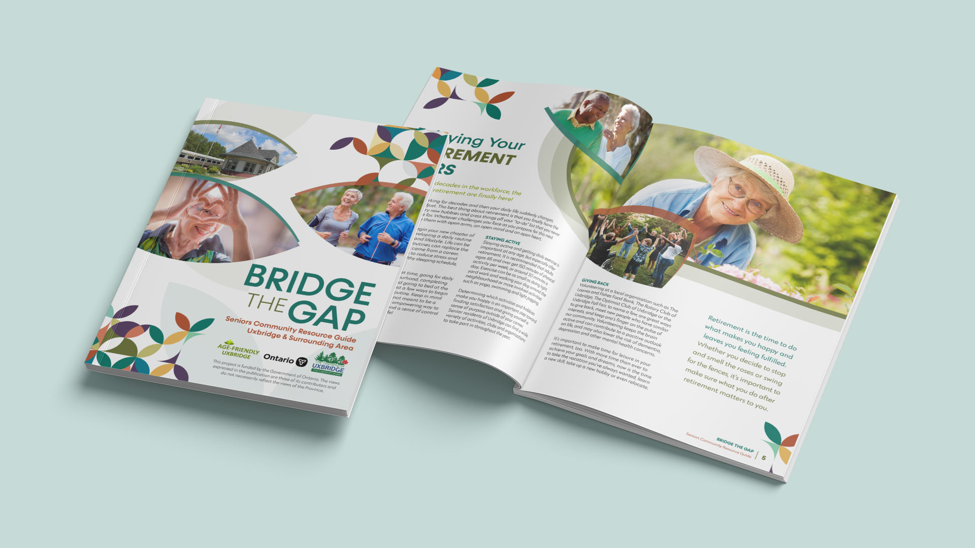
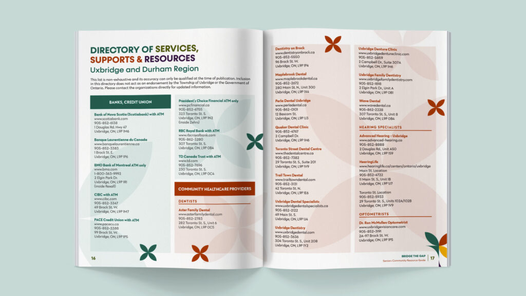
Bridge the Gap: Seniors Community Resource Guide for Uxbridge & Surrounding area was an extra special project which allowed us the opportunity to flex both our copywriting and design skills.

bridge-the-gap-magazine-cover-article-design

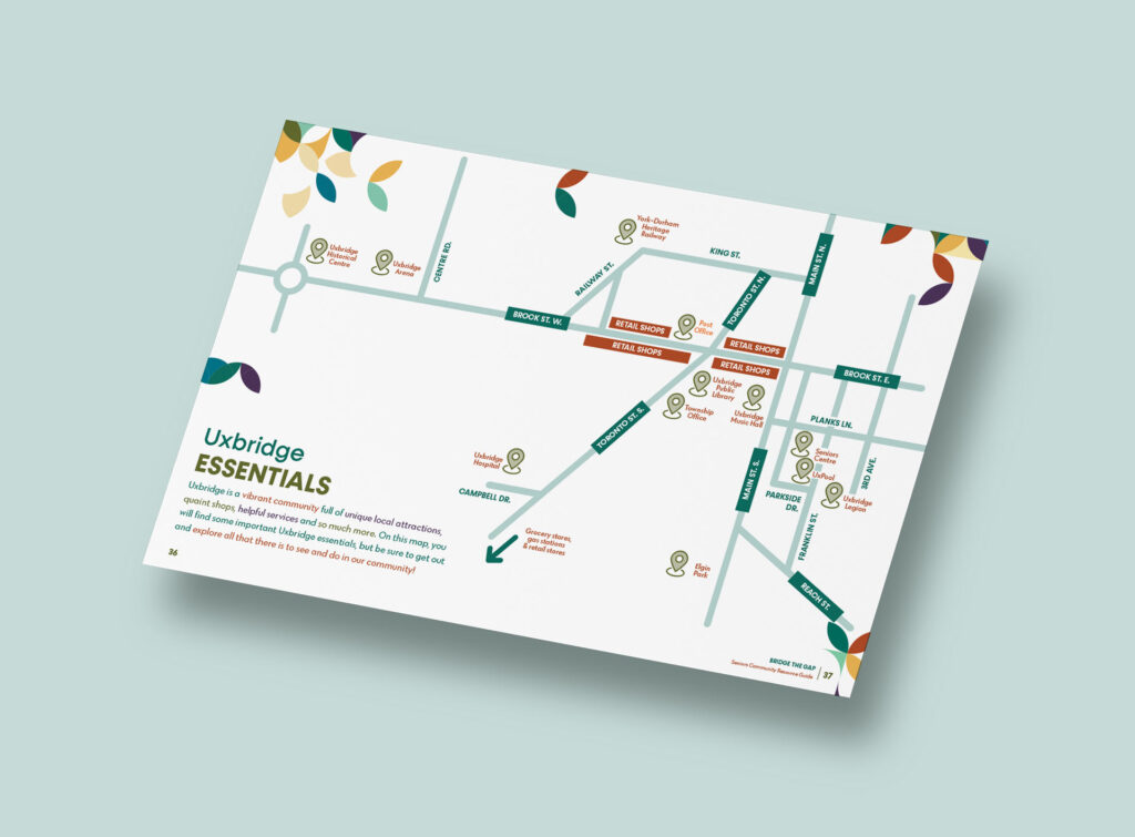
This 40-page booklet was filled with relevant articles, a community directory with local services and supports for seniors, as well as a map of Uxbridge essentials. The goal of this booklet was to help seniors actively engage in the community and enjoy everything that Uxbridge has to offer.

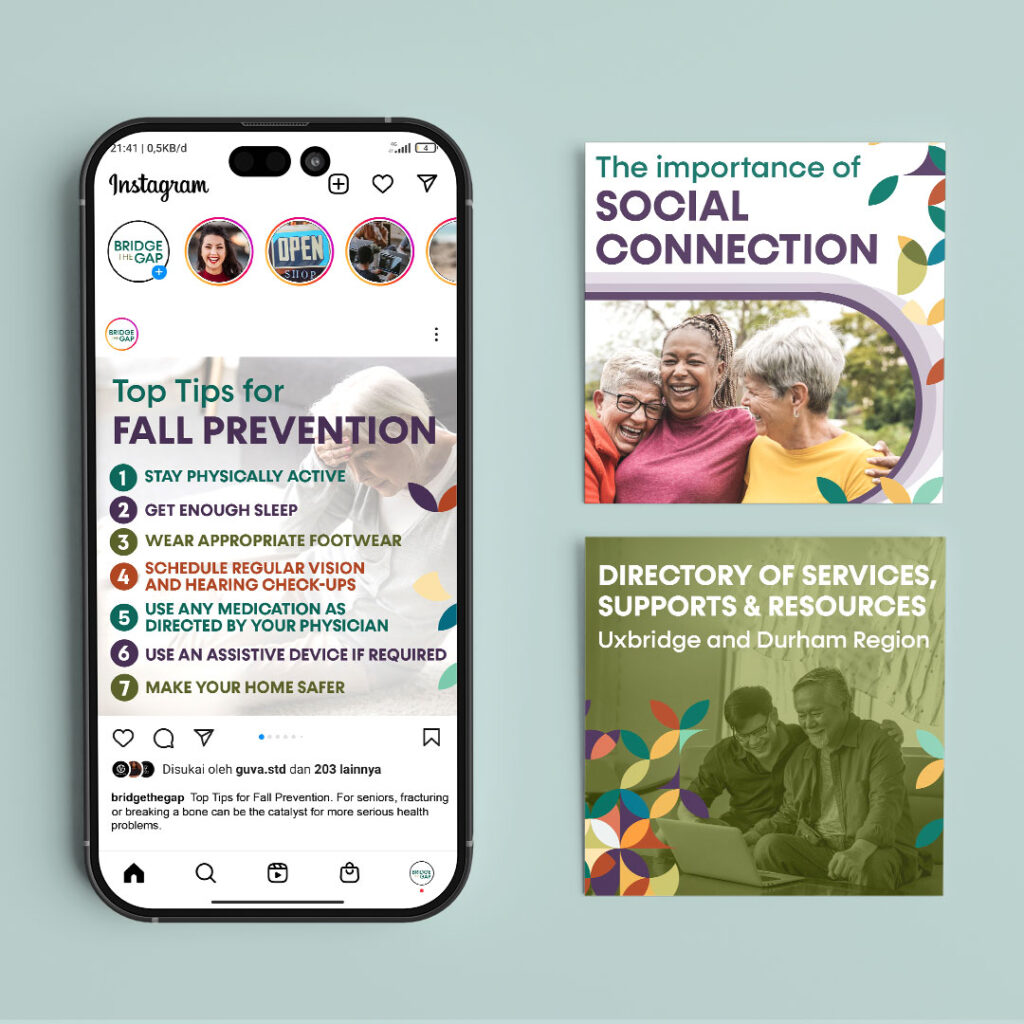
We worked with the Township of Uxbridge to cover issues that matter to seniors, like how to enjoy your retirement years, living independently, the importance of social connection, tips for fall prevention and staying safe from frauds and scams. We chose a unique colour palette and design elements that helped make the booklet’s content pop. To ensure the content was easy to read, we used oversized headings and increased the size of the paragraph text. In addition to creating the booklet, we also designed a poster and social media graphics to help get the word out once physical copies were available. This resource was widely distributed in the community, but if you missed your chance to grab a copy, you can click here find a digital version on the Township of Uxbridge website.

bridge-the-gap-magazine-map-design
bridge-the-gap-magazine-article-directory-design
bridge-the-gap-seniors-poster-design
bridge-the-gap-seniors-mobile-social-graphics-design

Back Door Mission

Back-Door-Mission-Window

Back Door Mission

Back Door Mission is a low-barrier access hub for essential supports, social services, and primary health care.

Back-Door-Mission-Logo

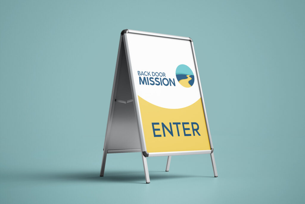
When the Back Door Mission team reached out to us about a new logo design, we couldn’t wait to work with an organization that does such important work right here in Durham Region!

The Back Door Mission team was full of inspired ideas for their new logo design. They wanted it to reflect the bigger picture of the work that they do. The path for those who access their services often isn’t linear, but Back Door Mission is there to light the way. This journey towards a brighter future is at the heart of their new design. The bold text, welcoming colour palette and calming flow of the graphic make their new visual identity feel both approachable and empowering. We hope this new design will help Back Door Mission have a positive impact on many more lives in our community.

To learn more about Back Door Mission, head over to backdoormission.ca.

Back-Door-Mission-A-Frame
Back-Door-Mission-Business-Cards
Back-Door-Mission-Window
Back-Door-Mission-T-Shirt
Back-Door-Mission-Mug

Therwood Heating & Cooling

therwood-logo-design-tagline

This eye-catching new look for Therwood Heating and Cooling began as an effort to elevate their old branding to match the level of quality Therwood has been providing for over 25 years.

Continue reading