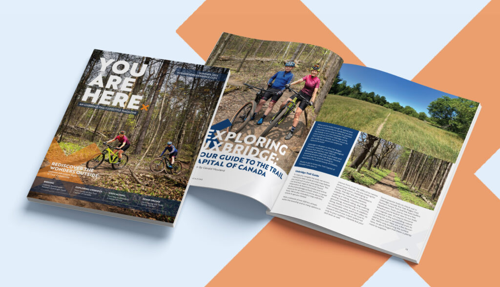
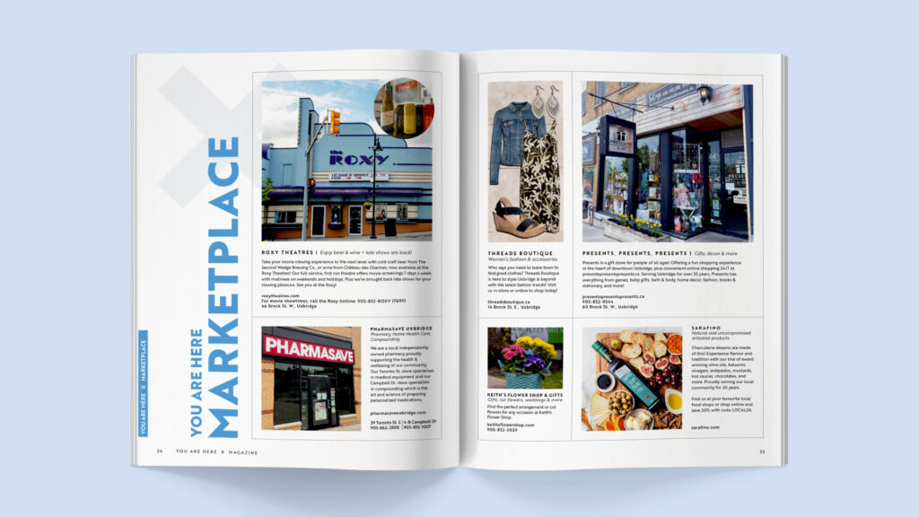
Featuring engaging articles, a local marketplace curated with the best products of the season, recipes and more, You Are Here is not only filled to the brim with content you’ll love, it’s also beautiful to look at too! This quarterly magazine, produced and designed by our in-house team here at Take Root Creative, is free for readers and is available at many locations around town.
This new quarterly publication began in the Spring of 2020 when we had some extra time on our hands. Our team had always wanted to launch a print publication, but we never had the time to get this up and running. Despite having a fully realized magazine ready to go in early 2021, it was not the right time to launch. Many businesses were still closed or operating at a lower capacity. We couldn’t imagine asking them to buy an ad in our new venture. Fast forward to the start of 2023 and the timing felt right. We jumped back into the magazine planning with full force and finally launched You Are Here in June 2023.
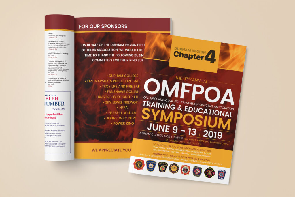
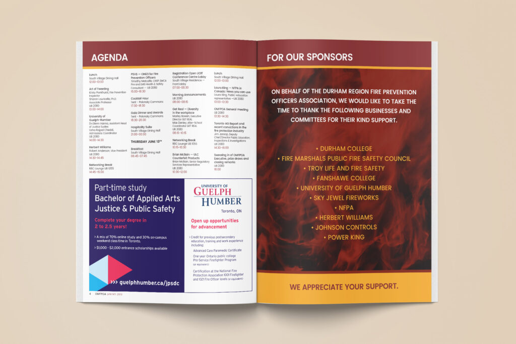
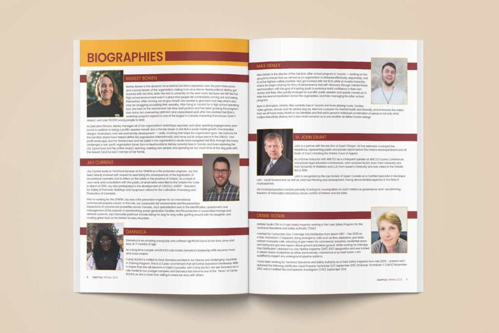
Back in 2019, our team was contacted to help design a booklet for the 63rd Annual Ontario Municipal Fire Prevention Officers Association (OMFPOA) Training & Educational Symposium, happening at Durham College UOIT Campus. This event was hosted by the Durham Chapter with support from the Ajax, Brock, Clarington, Pickering, Scugog, Uxbridge and Whitby fire prevention divisions.
This 20-page booklet included the Symposium Agenda, speaker biographies, ads and more. Our goal was to provide a booklet that was easy for attendees to navigate through and we achieved exactly that with a strong colour palette, clean font and organized layout.
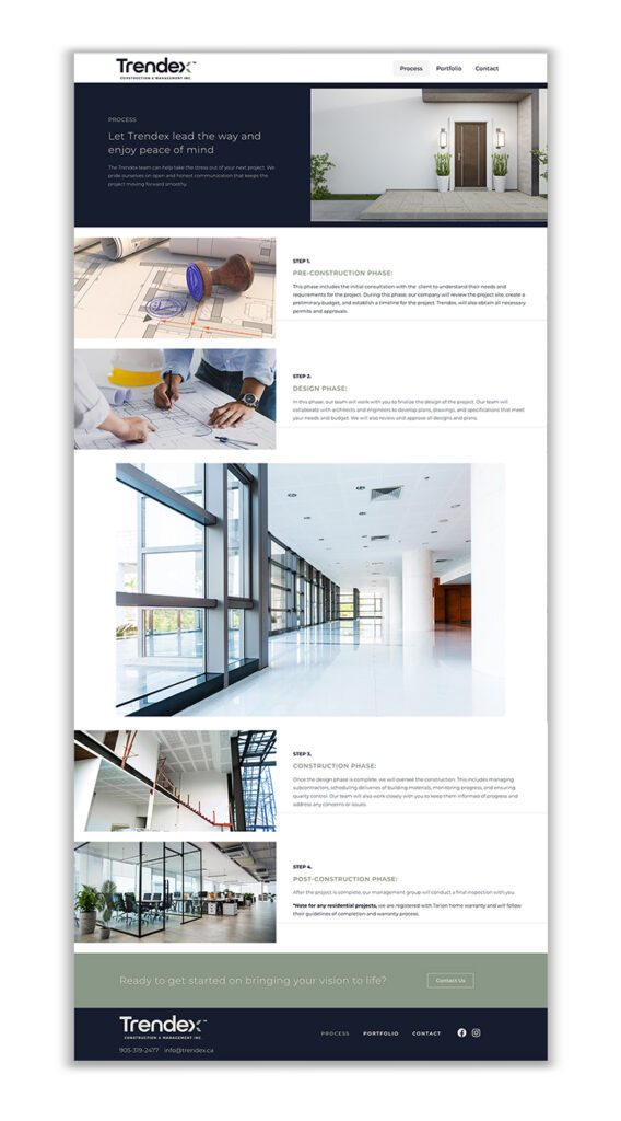
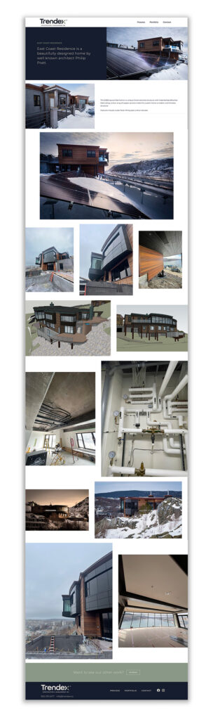
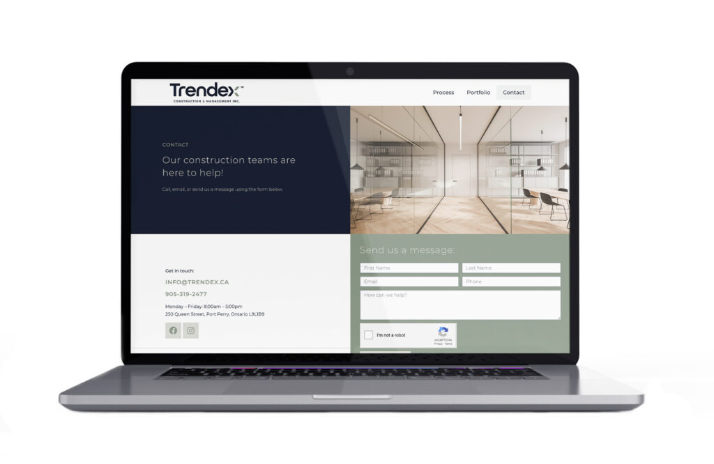
When Trendex Construction & Management approached us, they were looking to get rid of their existing outdated site in favour of something with a clean and modern design. We knew the first step to getting there was to really nail down the colours, photo treatments and fonts that would work together to create the fresh look they were hoping for.
We began the project with a style guide and landed on a combination of dark blue, sage green and light gray for the colour palette. These colours, paired with ample white space and some great project photos provided by Trendex, helped to create a website that boasts attainable luxury and inspires customers to imagine the possibilities of what their own space could be.
We wanted the site to have movement, without it being too distracting, so we added in a few subtle text and photo animations to bring it to life. We also downsized the main navigation, keeping only the pages that were essential to ensure that the portfolio was what really stood out.
In the end, we created a site that serves up a big impact while at the same time being minimal in its design. If you haven’t yet checked out trendex.ca, head on over there today!
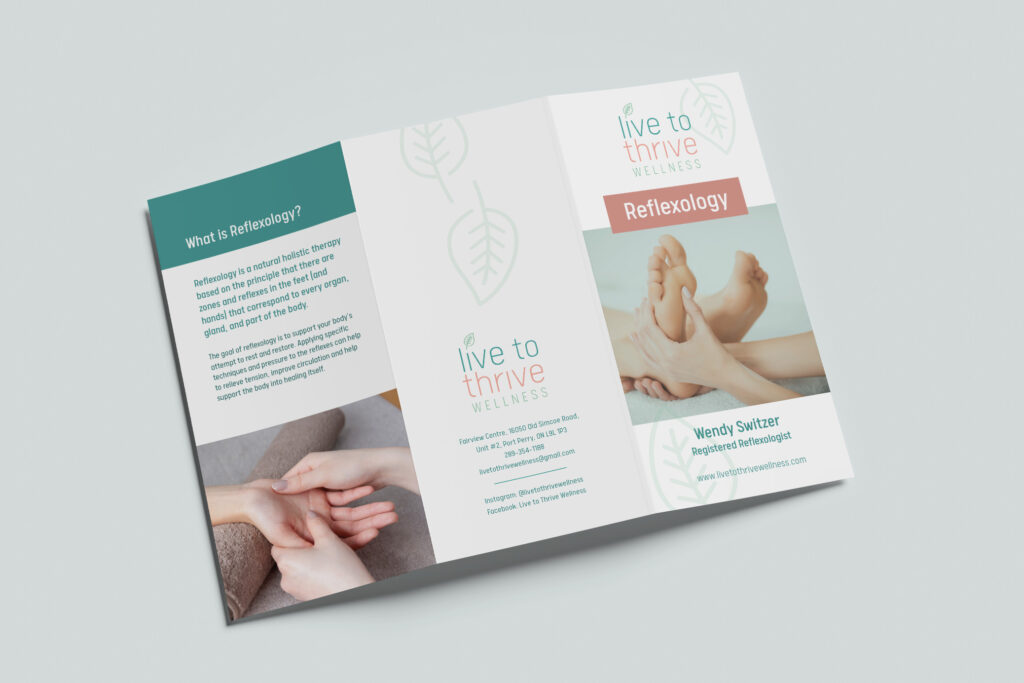
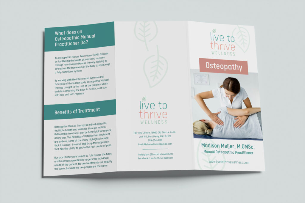
Live to Thrive Wellness is a dedicated wellness space in Port Perry complete with Registered Massage Therapists, Manual Osteopathic Practitioner, Registered Reflexologist, Hypnotherapist, Reiki Master and Certified Yoga & Pilates Instructors.
Live to Thrive Wellness is a dedicated wellness space in Port Perry complete with Registered Massage Therapists, Manual Osteopathic Practitioner, Registered Reflexologist, Hypnotherapist, Reiki Master and Certified Yoga & Pilates Instructors.
When Live to Thrive first began, they came to us for help with a logo design. We wanted to create something that like the business itself felt welcoming, claming and included a nod to nature. What we came up with was a pretty pastel colour palette and font combination that feels light and airy, perfect for a business whose main goal is to help restore and enhance your wellbeing. In the years that followed we worked with Live to Thrive on a variety of other print materials such as business cards, brochures, signage, flyers and more. We also found along the way that adding black to the colour palette and making the colours a touch bolder would really make their logo pop and allow their marketing materials to feel energized.
Proof that a great brand’s work is never done – there is always room for growth!
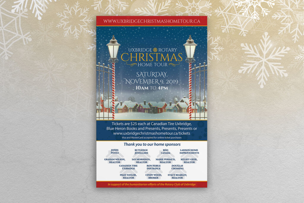
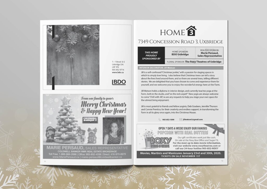
The Uxbridge Rotary Christmas Home Tour is a cherished tradition for many in our community as it marks the unofficial start of the holiday season.
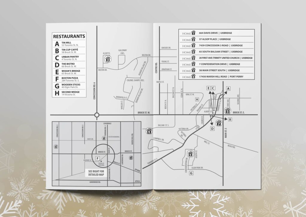
If you haven’t had the pleasure of attending before, the Home Tour is a self-guided tour that takes you through beautiful homes in the area that are all dressed up for Christmas. Each stop on the tour has a local Home Sponsor, a Realtor Sponsor and a Floral Sponsor and is paired with a local designer who brings the magic of Christmas to life inside.
Though the Covid-19 pandemic unfortunately caused the tour to be cancelled several years in a row, it’s on it’s way back for 2023 and we couldn’t be more excited. One of our favourite marketing pieces from the tour is the passport booklet which acts as both a ticket and a guide for the event. The passport features information about the homes on the tour including a map so you can ensure you’re in the right place. It also features a variety of ads from local business, some of which are submitted by advertisers and others which the Take Root team designs. In addition to the passport, we’ve also had the chance to design posters, signage and more to support the event.
It’s always fun to work on a seasonal event, especially when the prep work is done months in advance…Christmas in July anyone?!
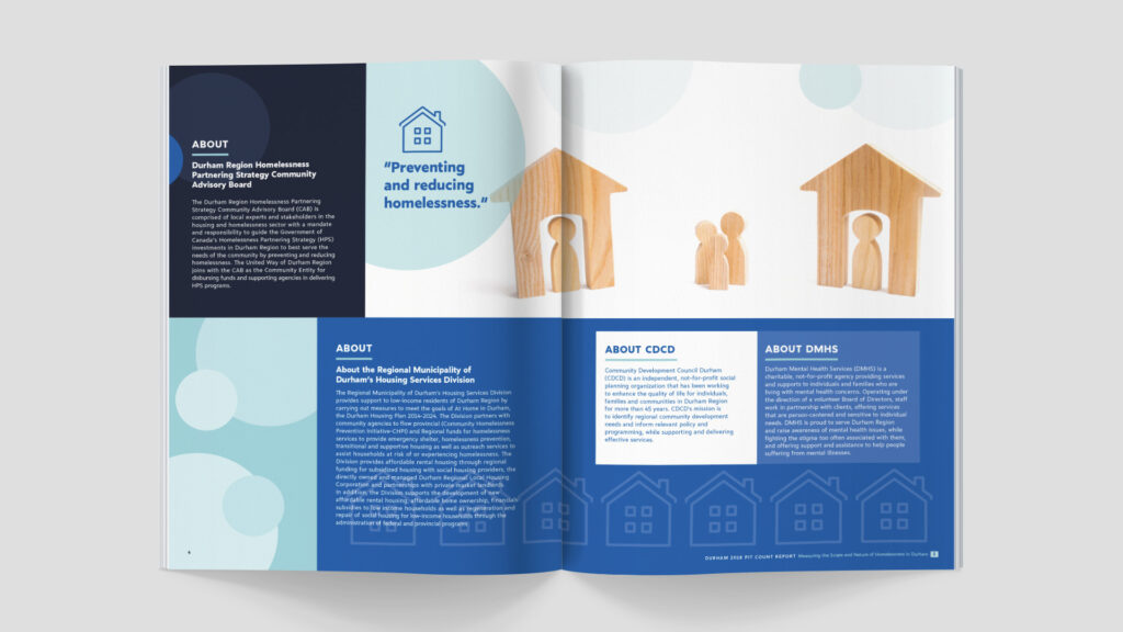
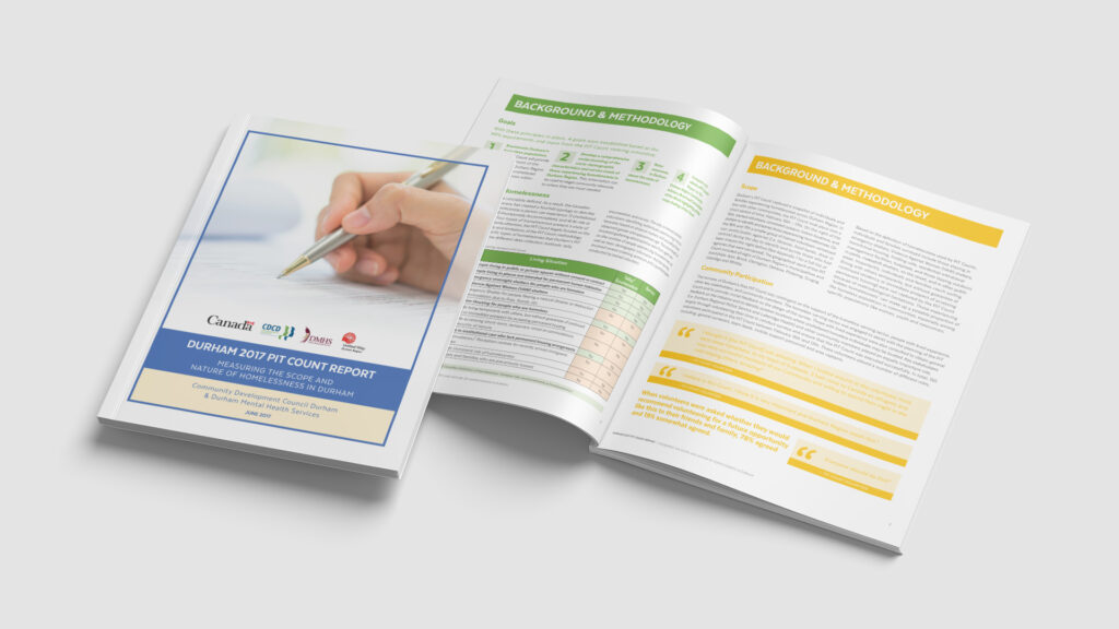
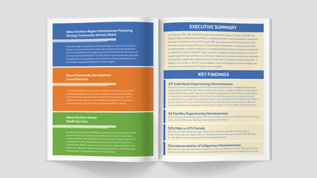
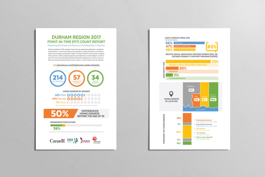
Over the years, we have been a part of a variety of different reports and marketing materials for CDCD - Community Development Council Durham. CDCD has been working to empower individuals, support families and strengthen Durham Region for the past 50 years. Not only did this give us the opportunity to create some really great designs, it also allowed us to learn so much about social issues in our area.
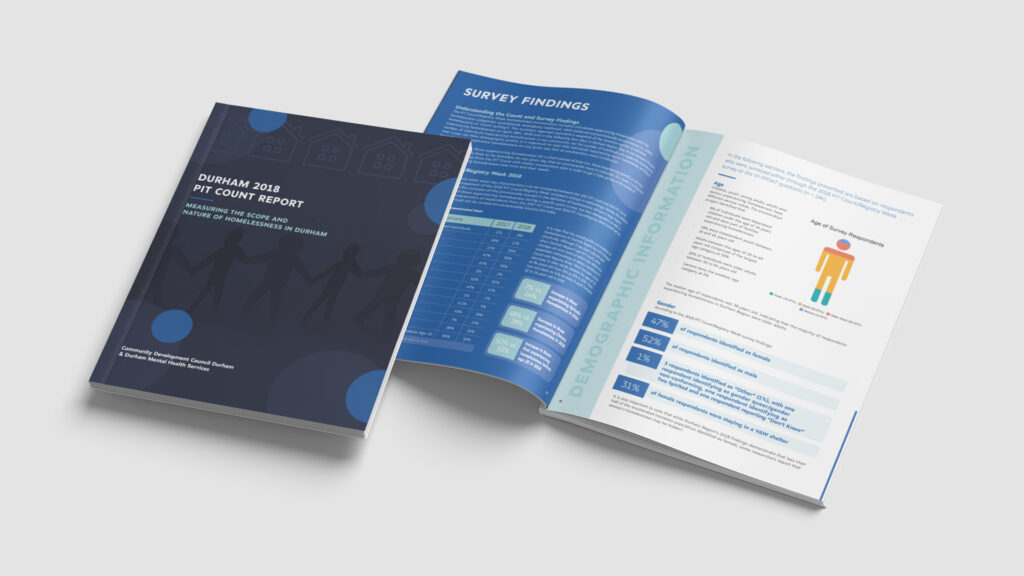
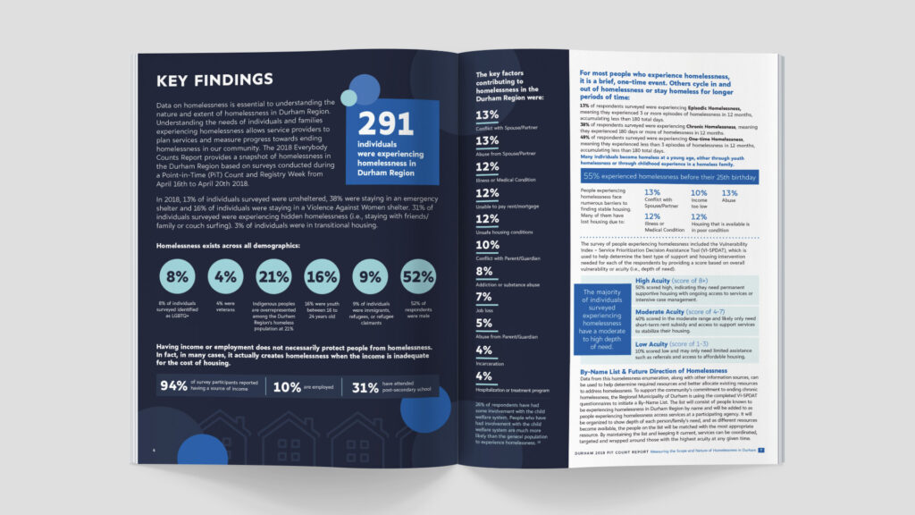
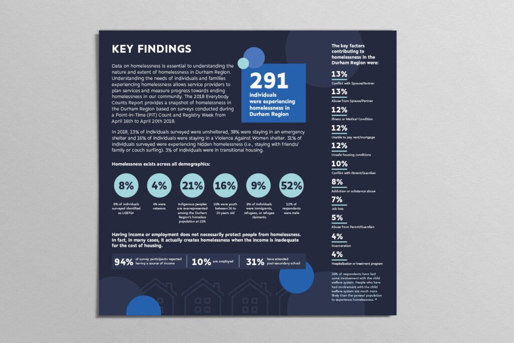
DURHAM 2018 PIT COUNT REPORT
One of the projects we worked on with CDCD, for two years in a row was the PiT or Point-in-Time Report. This report measured the scope and nature of homelessness in Durham, providing a picture of who is struggling and why, as well as what we can do better to support them. The results of this project were presented in two ways – a full report and an infographic to more concisely sum up the main findings. For both pieces, it was important to ensure the information was being relayed in a clear and concise manner, with the infographic providing a more visual representation of the report.
Designing reports like the PiT Report feels very rewarding as we are helping an invaluable local organization get the word out about the needs of our community. From a design standpoint, we also really enjoy working on reports as it gives us a bigger canvas to flex our creative skills – pulling together multiple pages into one cohesive and beautiful design.
To learn more about CDCD, please visit their website at www.cdcd.org.
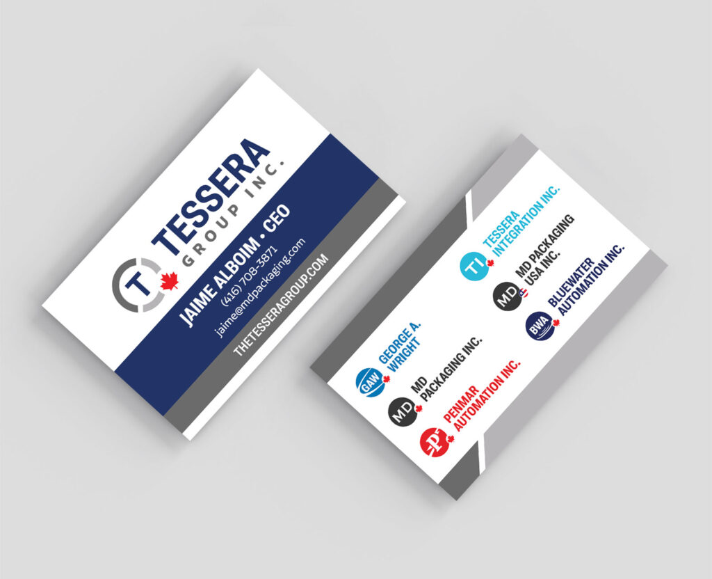
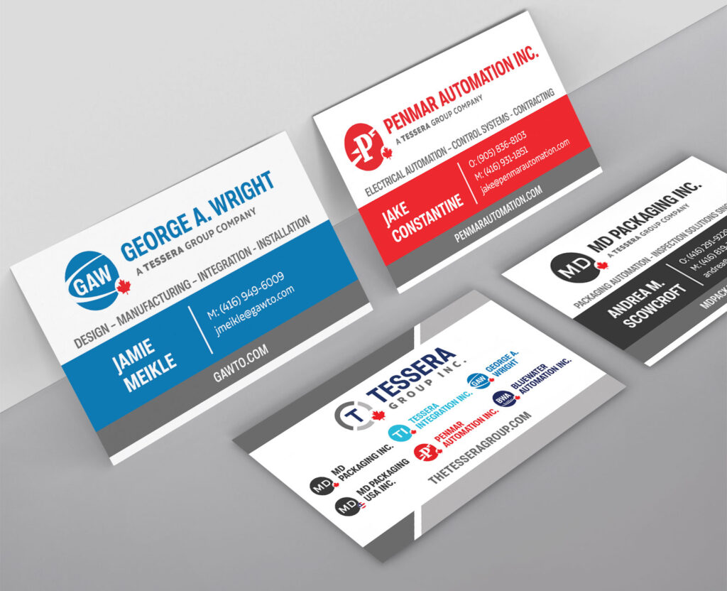
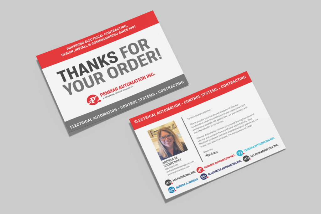
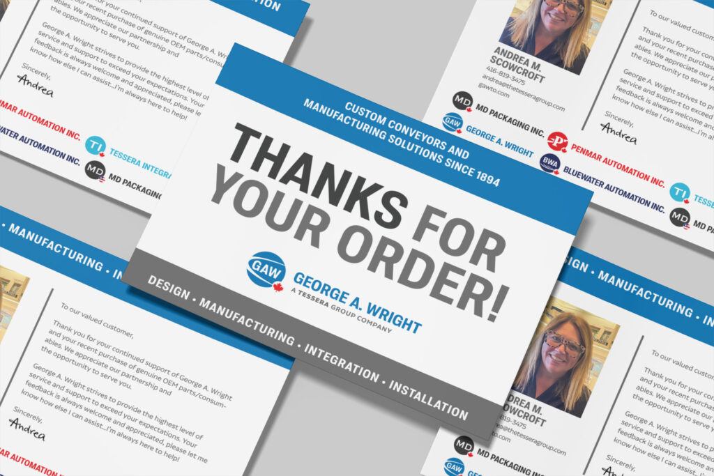
With over 100 years of combined experience in the Food, Pharmaceutical, Automotive and General Manufacturing sectors, Tessera Group Inc. delivers exceptional value to its partners across multiple industries.
When we met with our friends at the Tessera Group, we found out that we would have the opportunity to not only create their main logo, but also the logos for the 6 companies that make up the group. This was an interesting project for us as we had to navigate how to develop a unique logo for each company that can stand alone, while also upholding the Tessera Group visual identity. After trying out a few different styles, we achieved cohesiveness by using a consistent font, shape and maple leaf icon, while using colour as a way to help differentiate the brands. What we ended up with is a group of logos that look great together and apart!
In addition to the logos, we also have a variety of other print and digital projects on the go with Tessera Group, including business cards, postcards, social media cover photos, letterhead, websites and more.
Watch for the new Tessera Group corporate headquarters coming to North Port Road in Port Perry!
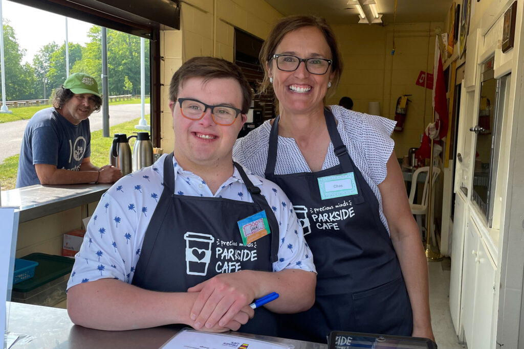
Since 1999, Precious Minds has been supporting children, youth, and adults with developmental challenges in North Durham.
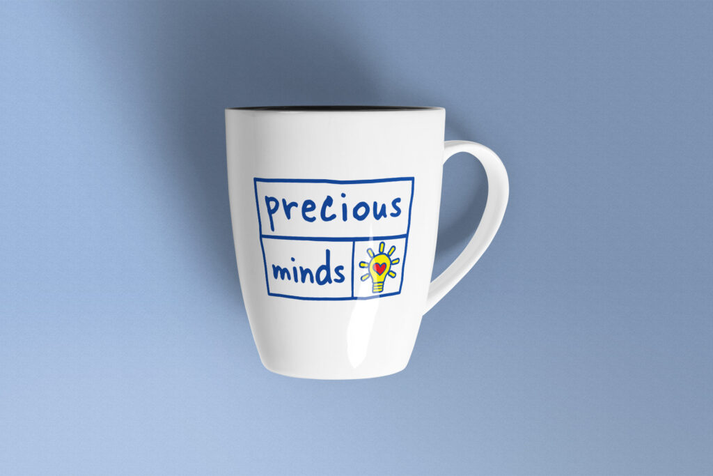
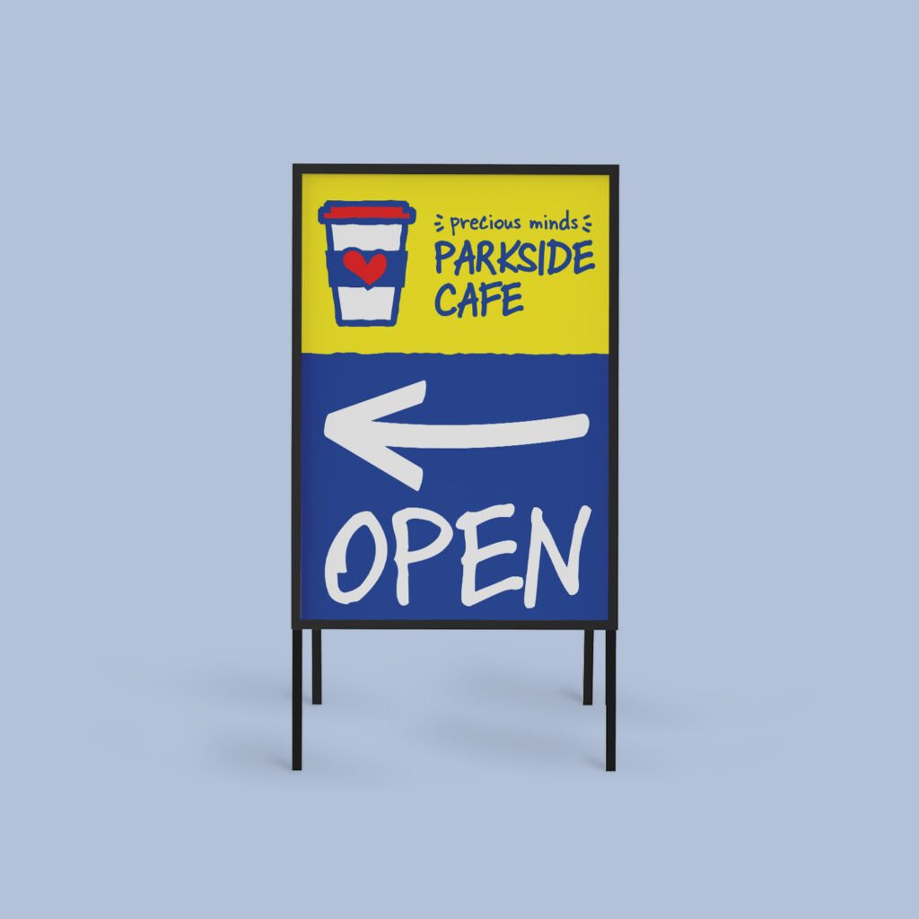
The logo that Precious Minds came to us with was one that was easily recognizable within our community and it was important to the Precious Minds team to maintain this brand awareness moving forward. The only issue with the existing logo is that they felt it no longer accurately represented the population they serve.
The goal of this logo refresh project was to keep the look of the Precious Minds logo that we had all come to know and love, but make a few slight adjustments to ensure it would appeal to both children and adults. To achieve this, we updated the font to one that is still playful and fun, but also has a more mature look to it. We applied this same idea to the lines within the logo, allowing them to keep an organic shape without it feeling too juvenile.
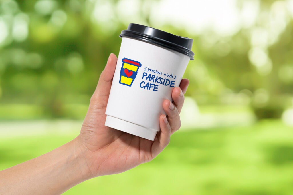
In addition to the main logo refresh, we were also asked to develop a new logo for their Summer Camp and Parkside Cafe. To tie all of the logos together, we used consistent colours and fonts, and included a simple but effective graphic (lightbulb, coffee cup and sun) with the Precious Minds’ heart inside for brand recognition.
Precious Minds was an absolute delight to work with and we are thrilled that we could provide them with a new design that closer reflects who they are. We are so pleased with the final look of this logo set and can’t wait to see these bright and cheery graphics around the community!
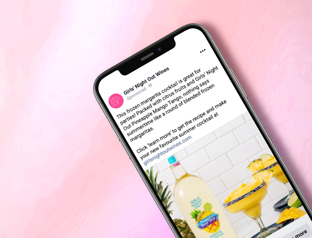
10% average order value increase compared to 2021 for duration of summer recipe and sale campaign with an 8% increase in returning customers.
Campaign:
Recipes and brand awareness
What we did:
Campaign management and strategy
Campaign Goals:
Campaign management and strategy
Achievements:
Successful brand awareness campaign with recipes appearing on screen over 101,000 times with a competitive cost-per-click well below industry average. 1
Pierre Laurent create award-winning timepieces sold at retailers all over the world. When the pandemic hit, they wanted to add an additional sales channel with an e-commerce website so we turned to the Shopify platform.