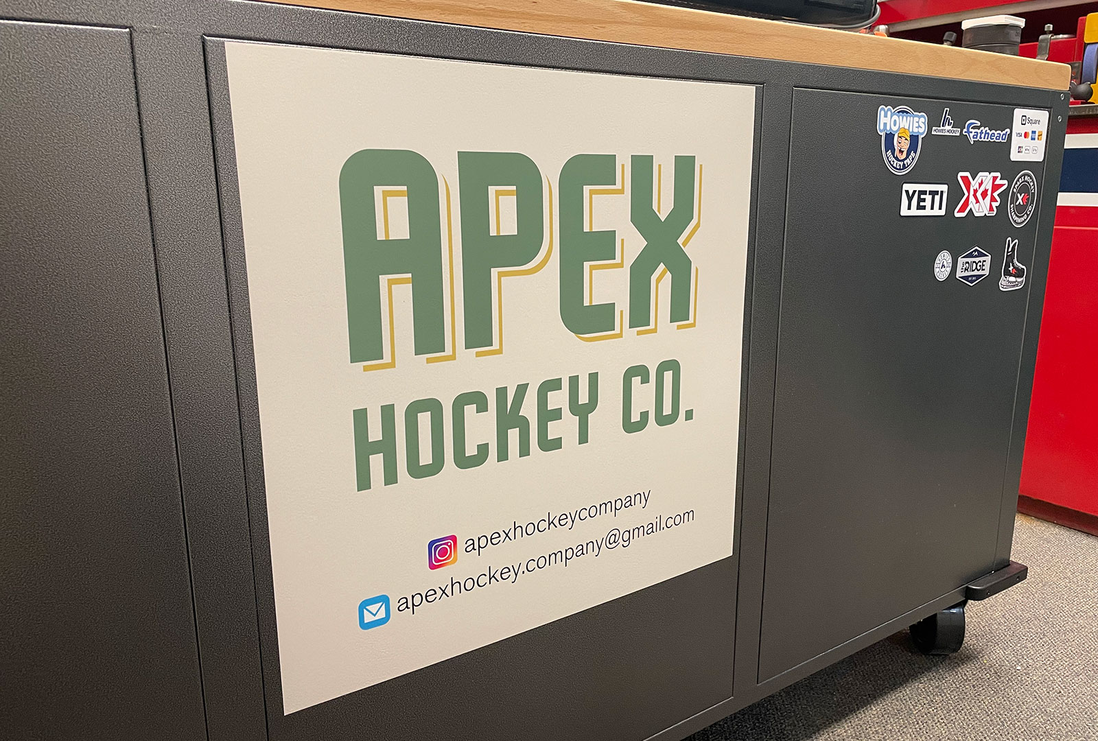
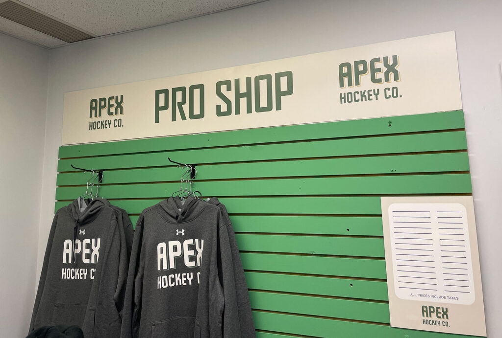
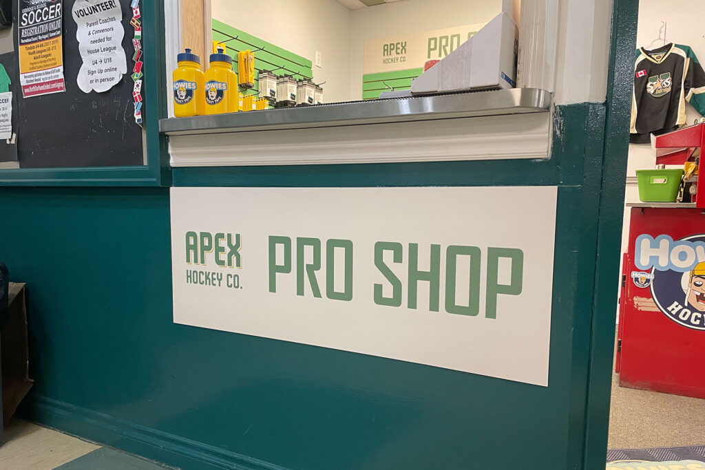
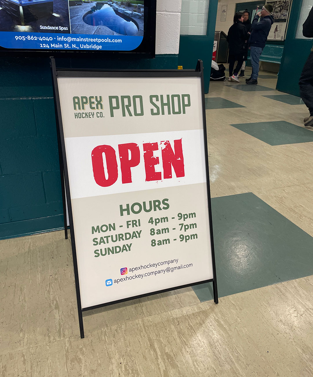
When the pro shop closed down at the Uxbridge Arena, Chris and Doug were among many hockey parents who missed the easy access to skate sharpening and other basics like tape and water bottles.
An opportunity arose to open a smaller shop in another portion of the arena so they quickly pulled together what was needed to make it happen during the height of the busy hockey season.
When they reached out to us to create a logo, they had very few requirements:
The name and logo needed to be generic enough to not lock them into only a pro shop as it may be used for other hockey-related ventures down the road.
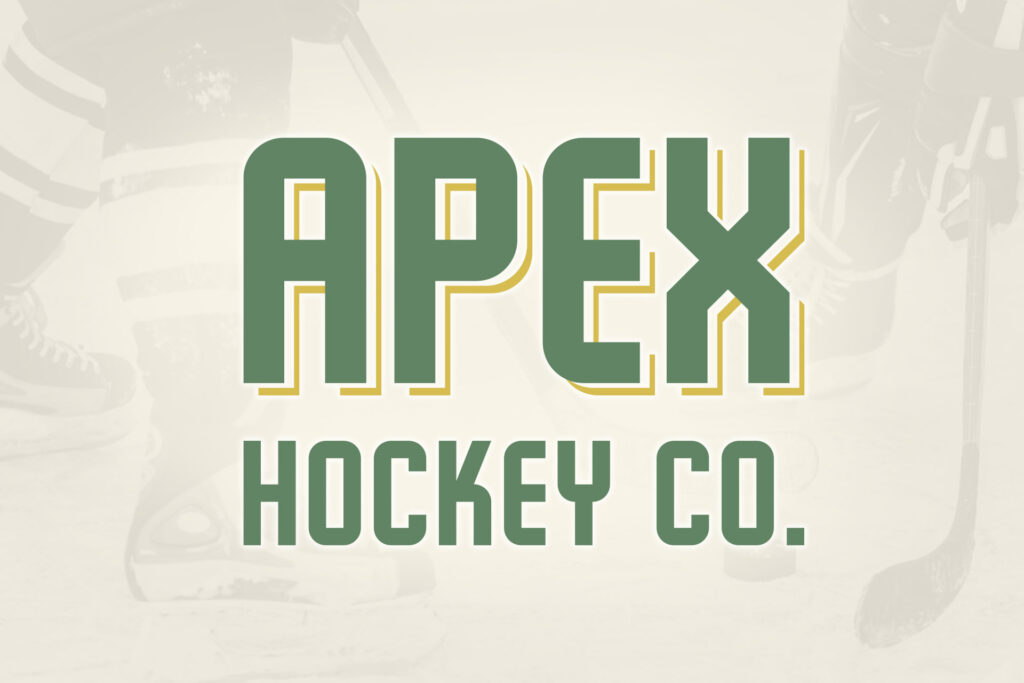
They wanted to see a retro hockey vibe both in the font and colours of the wordmark.
The timeline was a quick one since the store would be opening as fast as possible to begin offering skate sharpening right away. We put together a series of proofs – each design incorporating a unique retro font and with a colour scheme of cream, green and yellow. Originally the suggested colours were green and cream, but we’ve found that two-colour logos can prove to be limiting for other marketing projects down the road. We added a third colour (the yellow) to give the logo more depth and to provide a nice palette for future use.
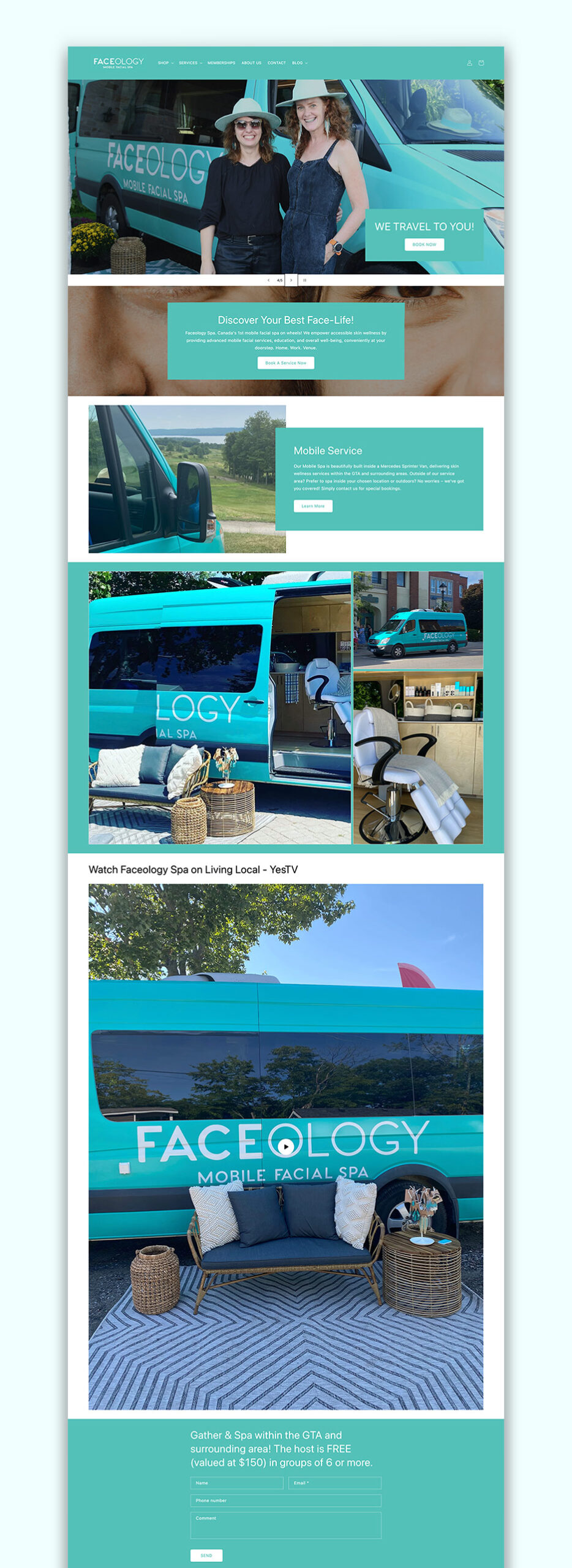
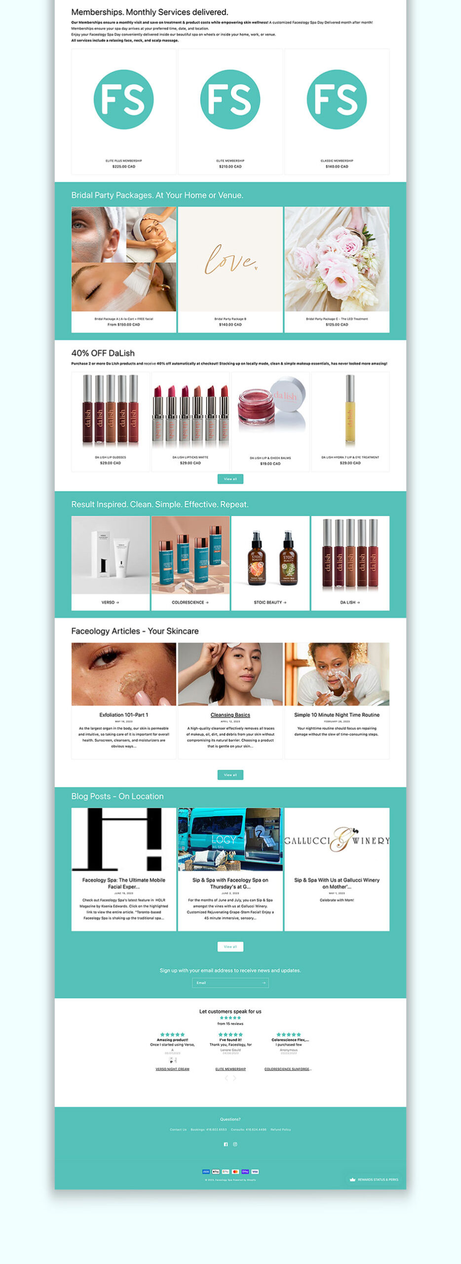
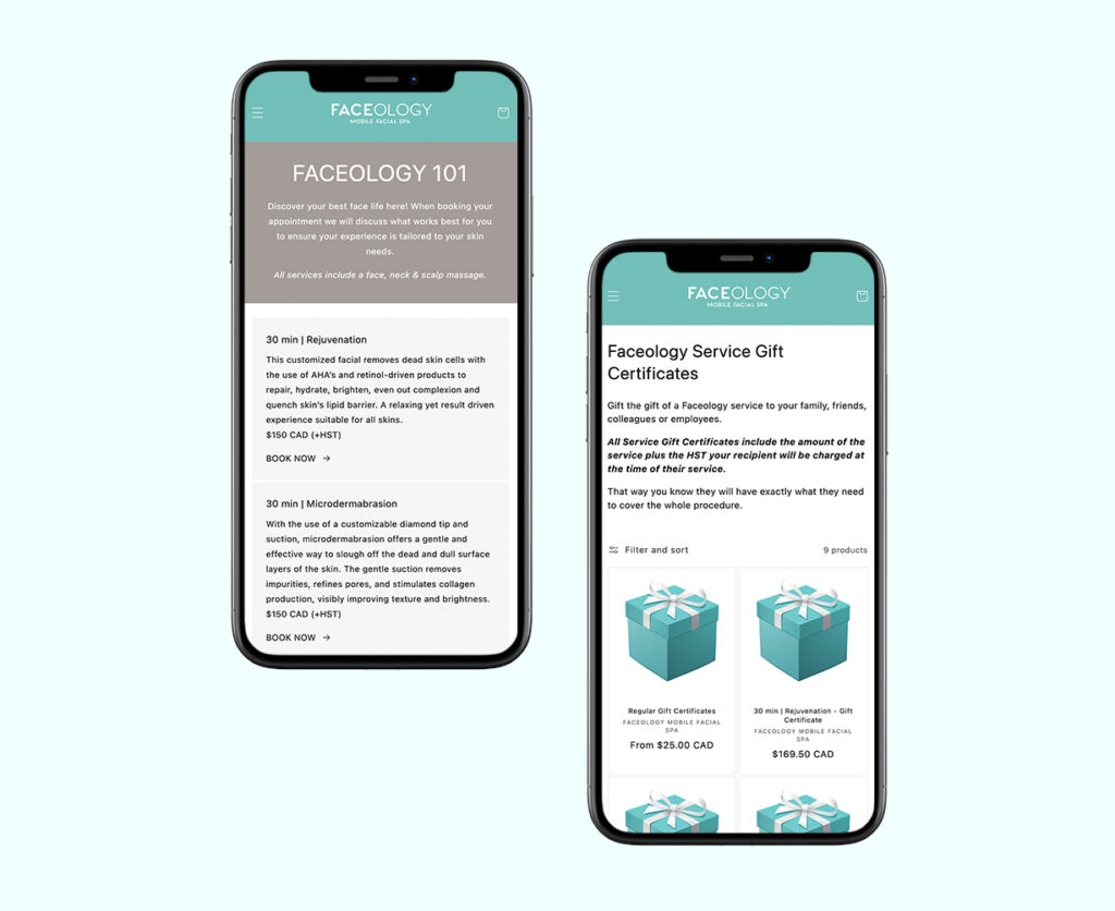
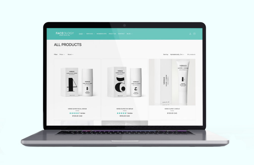
Despite being an obvious candidate for Shopify, Faceology had some unique needs to accommodate during the build of this website. In addition to selling skincare products, the site had to function as the place to start the booking process for an appointment as well as sell memberships.
As the start of the 2023 lacrosse season approached, the UMLA board decided it was time to update the logo to modernize it and reflect the new push to promote lacrosse to more families in the community.
The main challenge with team logos is that they are used in so many different ways. There are two different jersey versions – at home and away – plus all the other gear that receives a logo. This in addition to your typical applications both online and in print.
The name “Enforcers” is intentionally vague and in order to stay away from any reference to a particular type of “enforcer” the decision was made to use a word mark that would be strong in the existing black and white colour scheme they were already know for in the league.
The emphasis on the word “Enforcers” allows the band to be used isolated away from the shield when needed. The full word mark uses varying grey hues to give it a three dimensional look without creating issues for embroidery or other one-colour print applications.
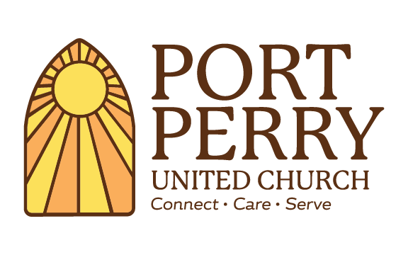
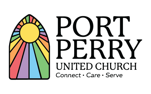
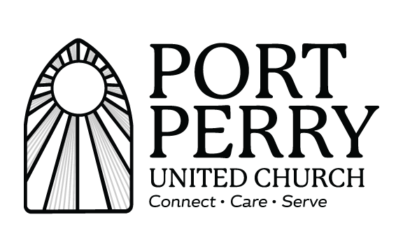
The Port Perry United Church has a long history in the town of Port Perry and a very prominent location of a large historical building in the downtown core. The main request in the brief was to use their large stained glass window as a graphic element in the new logo.
The final logo applied sun-like rays emanating from the centre of the window (a slightly different pattern than the actual window itself) to imbue additional meaning instead of the rather ambiguous glass pattern that actually exists.
We paired the window graphic with the font P22 Mackinac Pro which despite being a serif font also has a softer feel to it and therefore slightly more modern than other traditional fonts.
It was decided that a black outline (and font colour) would be too harsh in contrast to the vibrant lighter colours (the orange and yellow) and that brown was a better fit. The logo translated well into the two additionally requested versions: black and white and a rainbow version to be used in specific instances.
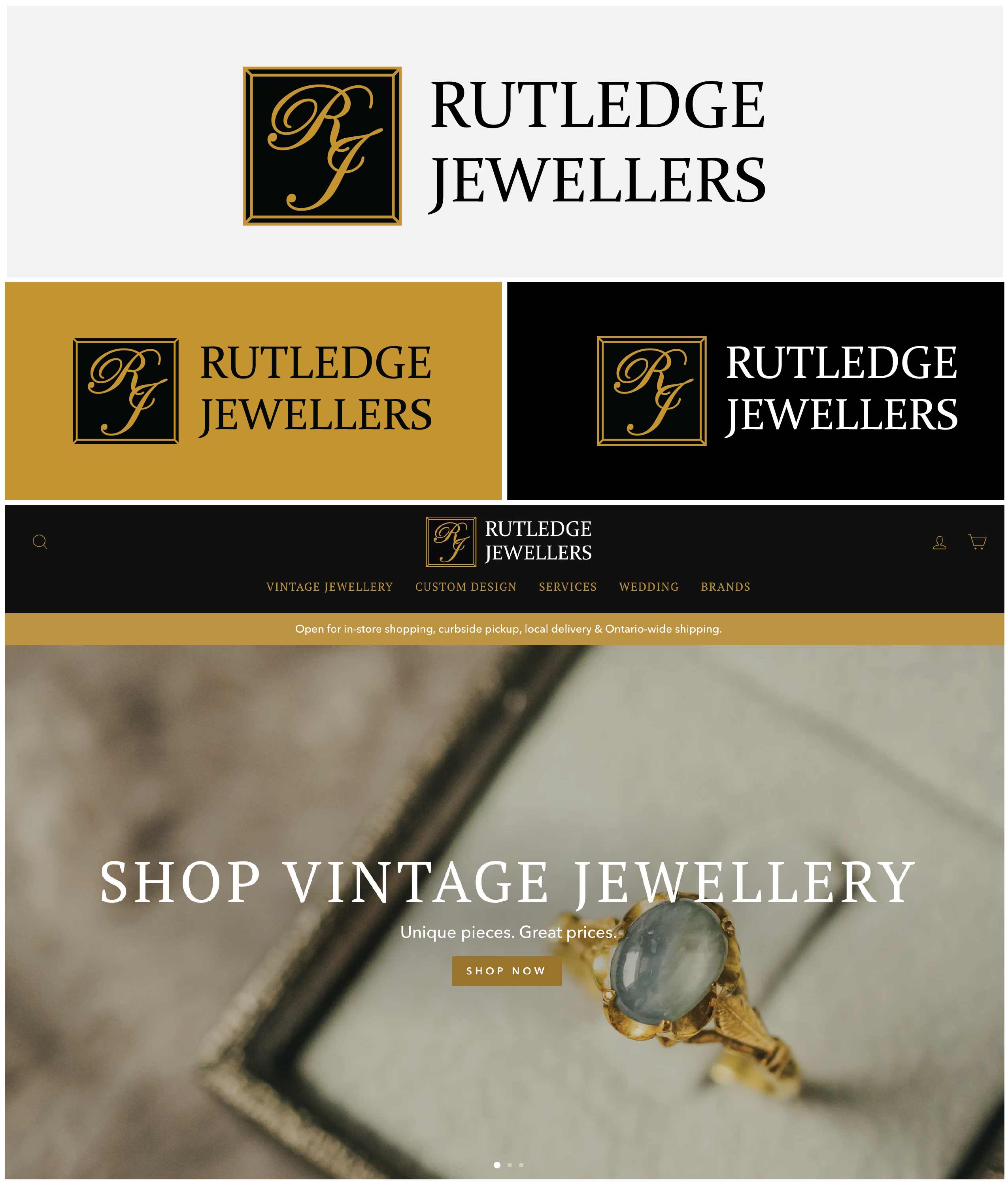
The challenge with any rebrand of a successful business is to create something new that doesn't lose the value of the original work in the process. Rutledge Jewellers has a 30+ year history in the town of Uxbridge in addition to an eye-catching storefront in a prominent downtown location.
To tackle this rebrand, we looked at what elements of the original logo stand out to customers so we could bring those forward in the new design. We kept the iconic script for the “R” and “J” pulling them together to create a signature icon that can be used as a stand-alone element or together with the full name.
Next, we selected a complimentary font to use for the full name. We wanted something timeless and classic but strong at the same time. Rutledge Jewellers occupies a beautiful heritage building in Uxbridge and immediately outside the store sits a large traditional clock providing a focal point as you enter the downtown core. This nod to the timelessness of past design is reflected in the new logo design.
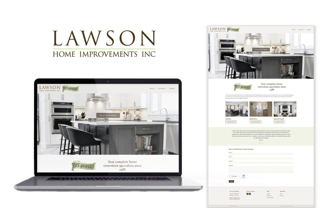
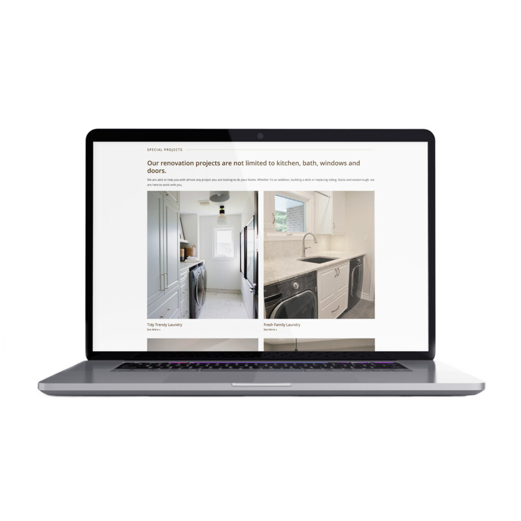
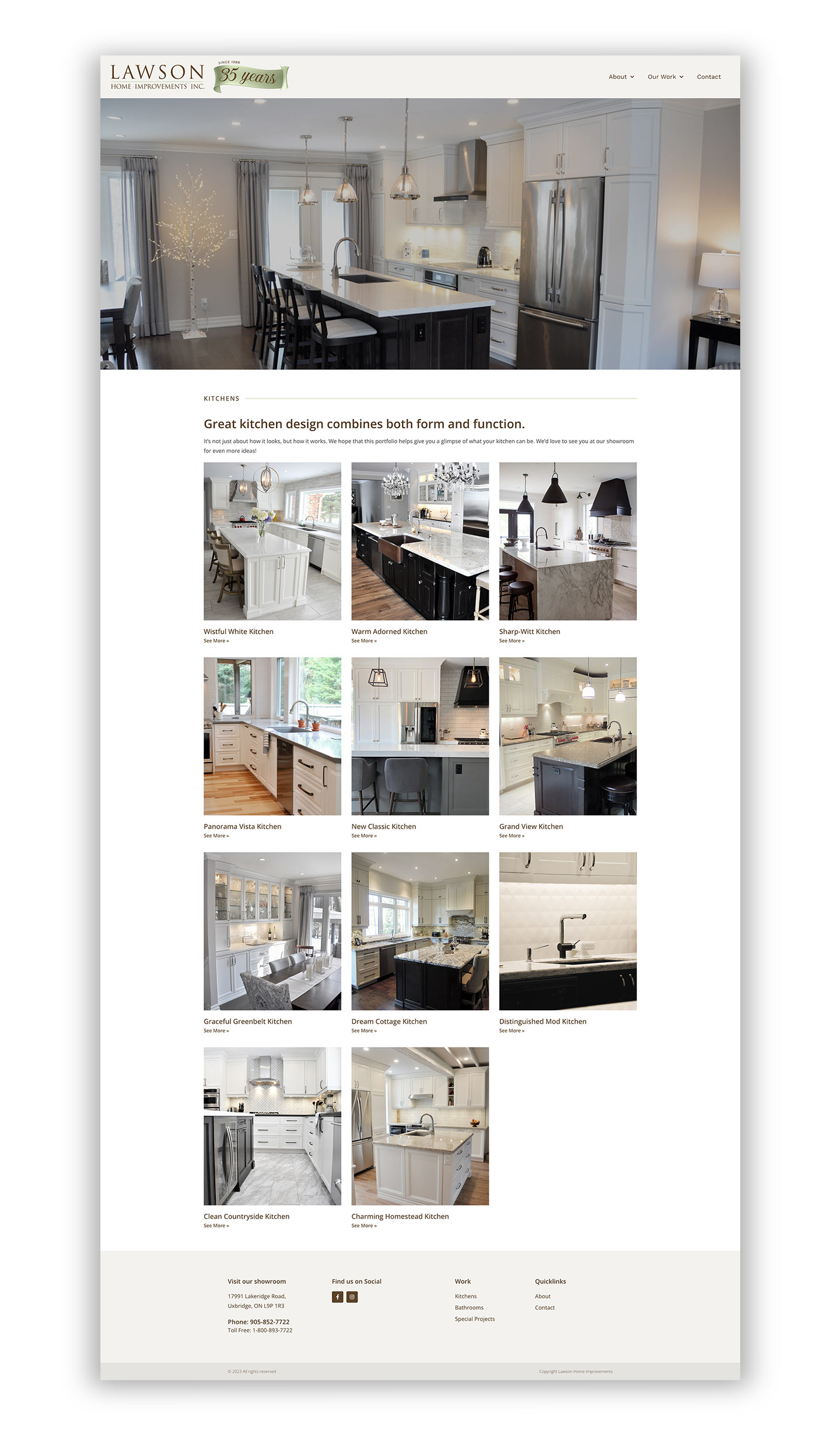
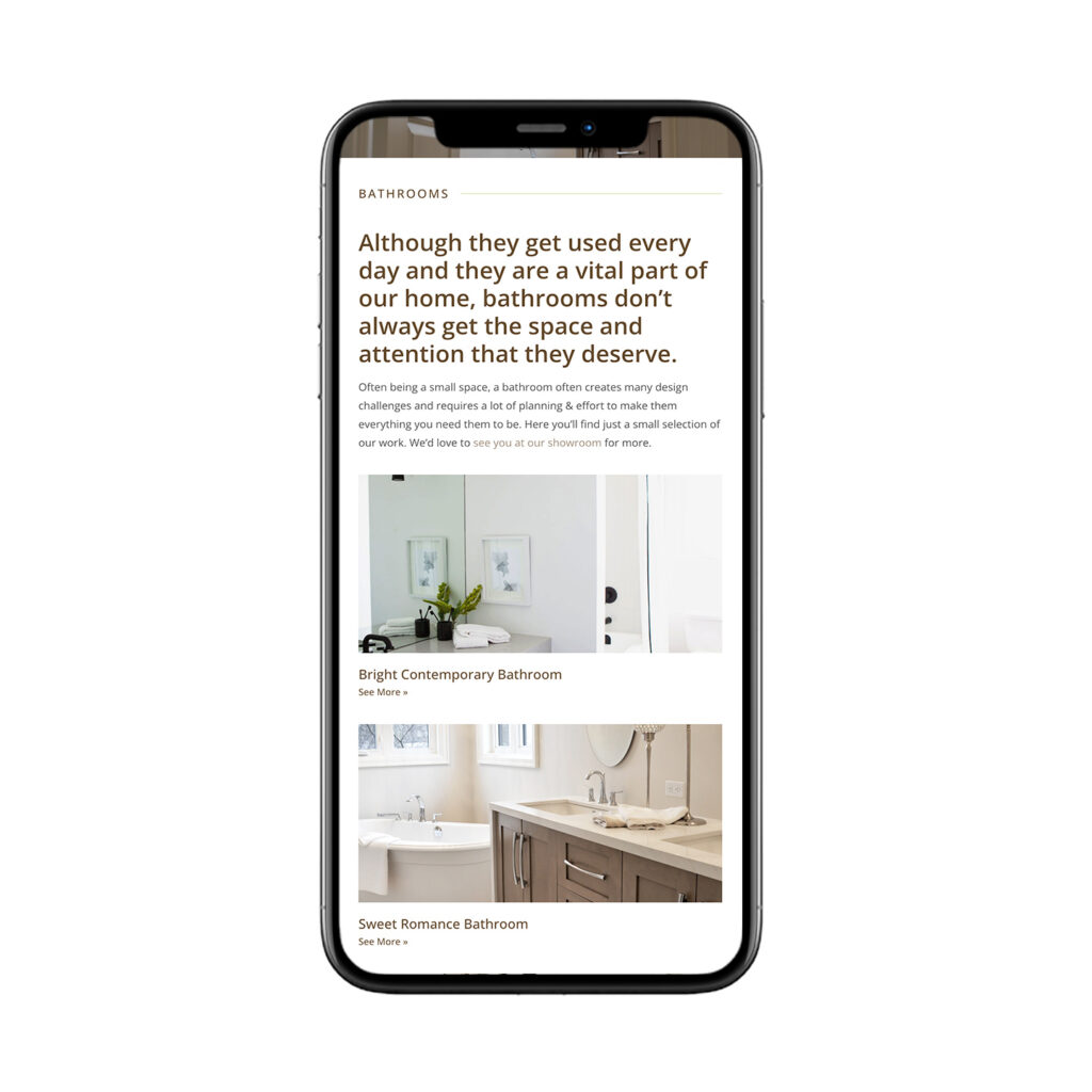
Since 1988 Lawson Home Improvements Inc. has been servicing Uxbridge and the surrounding areas as your home renovation specialists!
When Joe and Kim asked us about redesigning their website we were thrilled to say the least! We wanted to stay true to their aesthetic and create a website that highlighted the brand they built.
We created a website with a spotlight on their work and team which celebrated the past 35 years in business. Lawson Home Improvements is all about transforming your space into something beautiful – we’re so happy to be part of this transformation.
19Thirteen offers the same level of dental hygiene care provided by your dental office but in the convenience of your own home.
When Catherine asked about redesigning the logo for 19Thirteen, we were very interested! We loved the idea behind their name – 1913 being the year that Dr. Alfred Civilian Fones opened the first dental Hygiene school. And that same year he created the term “Dental Hygienist”
They wanted their icon to be distinctively ‘dental’ and liked the idea of ‘movement’ as a driver behind their brand. We wanted to come up with something to signify that they come to you. After some brainstorming we landed on a house motif included in the icon.
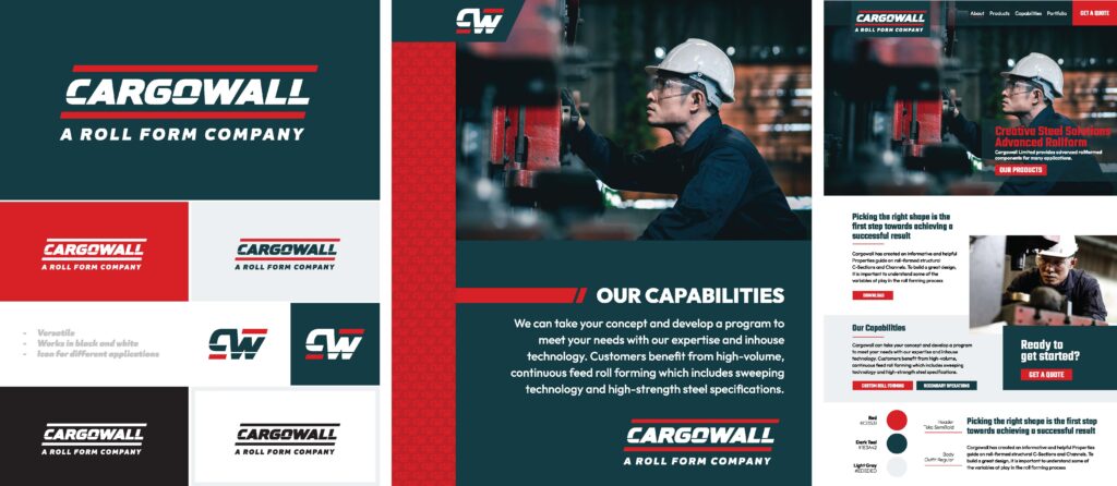
For over two decades, Cargowall Ltd. has proudly provided customers throughout North America with steel roll formed manufacturing solutions.
When Cargowall first reached out to us about a new logo design, they felt their current logo was dated and required some attention. They didn’t feel that the logo was telling customers what they do as a company – they wanted to connect more with their manufacturing audience. We put our heads together and came up with new designs and tagline which we felt best encapsulated their company.
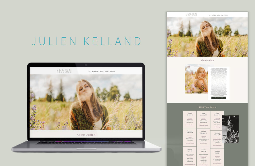
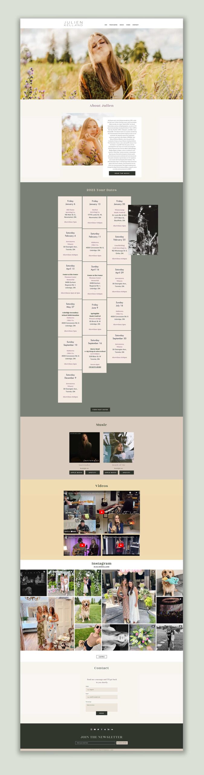
This Wix website is clean and easy to self-manage. A single-page site with an anchor link navigation makes it easy to find content while keeping it simple to maintain.
After using a WordPress website for several years, it was becoming out of date and clunky to manage. We switched Julien over to Wix and implemented a fresh new design and an easy-to-update layout. No more worrying about managing theme or plugin updates and Wix’s easy-to-use interface means that updating tour dates or adding new music is quick and simple.
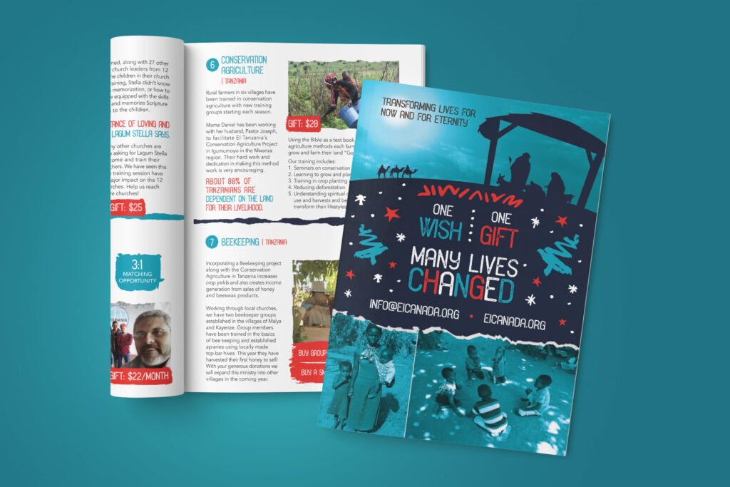
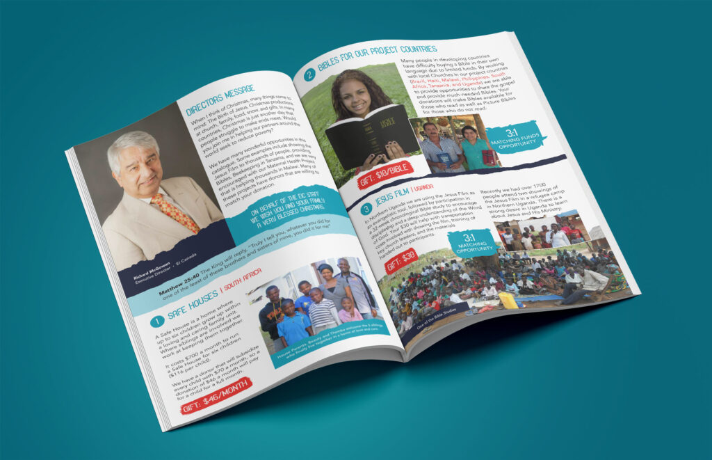
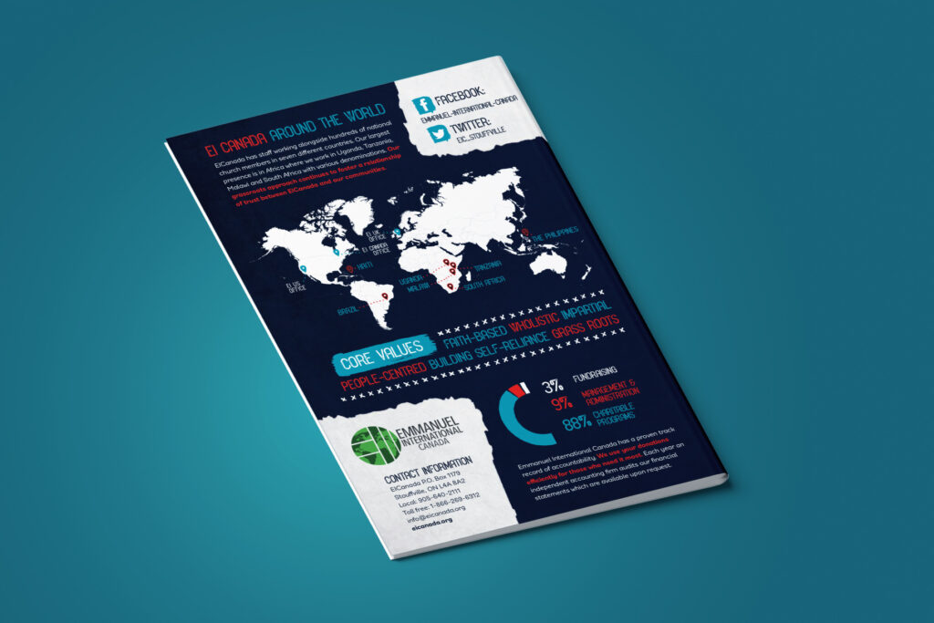
This Christmas catalogue is the key fundraising tool for the Emmanuel International Canada office to raise donations used throughout the year.
We began this project by creating a mini brand to set the tone. This included the cover page font, colours, graphic treatment and other elements. Once approved, we rolled this out to the rest of the pages of the catalogue. In addition to print, the graphics were also used online for the ecommerce website as well as social post content.