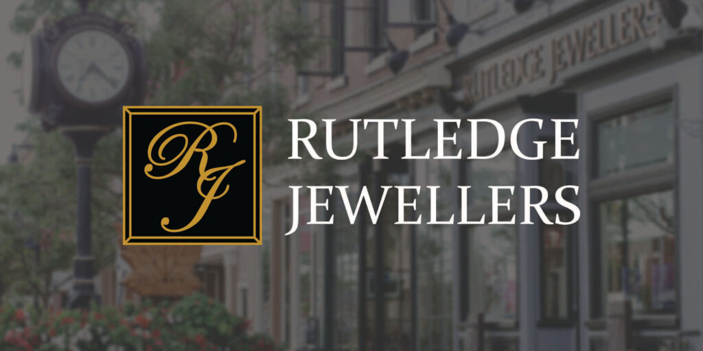
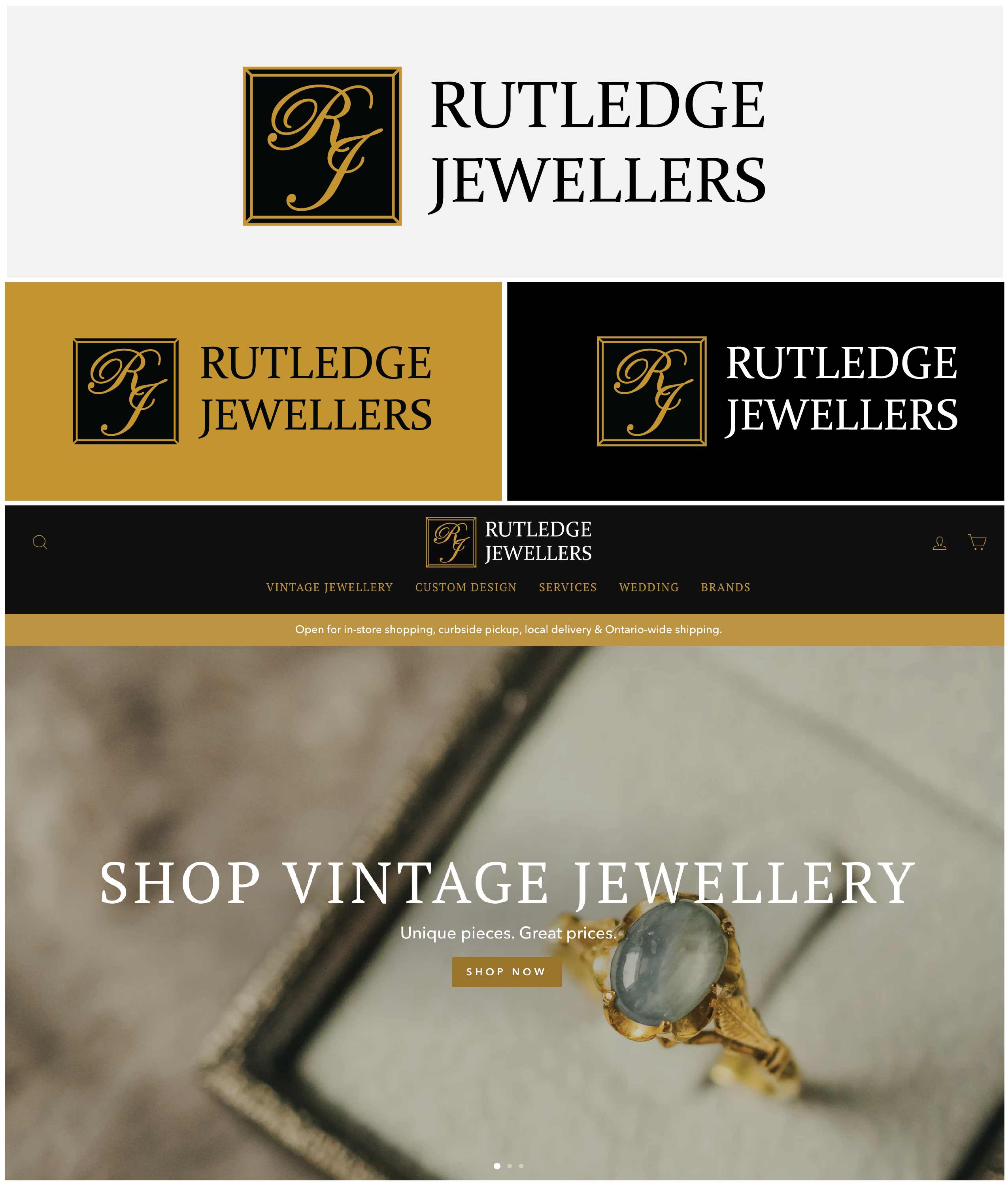
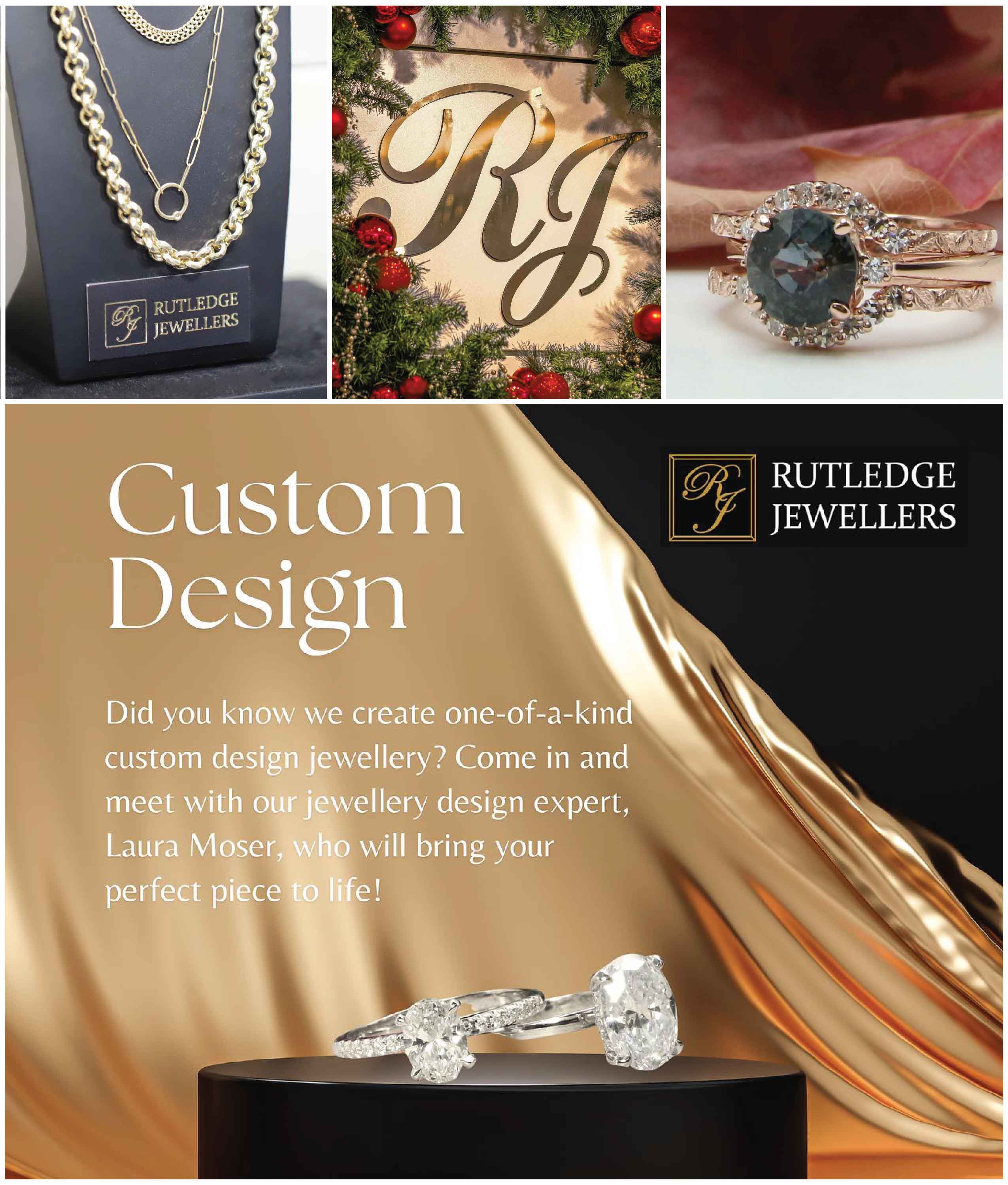
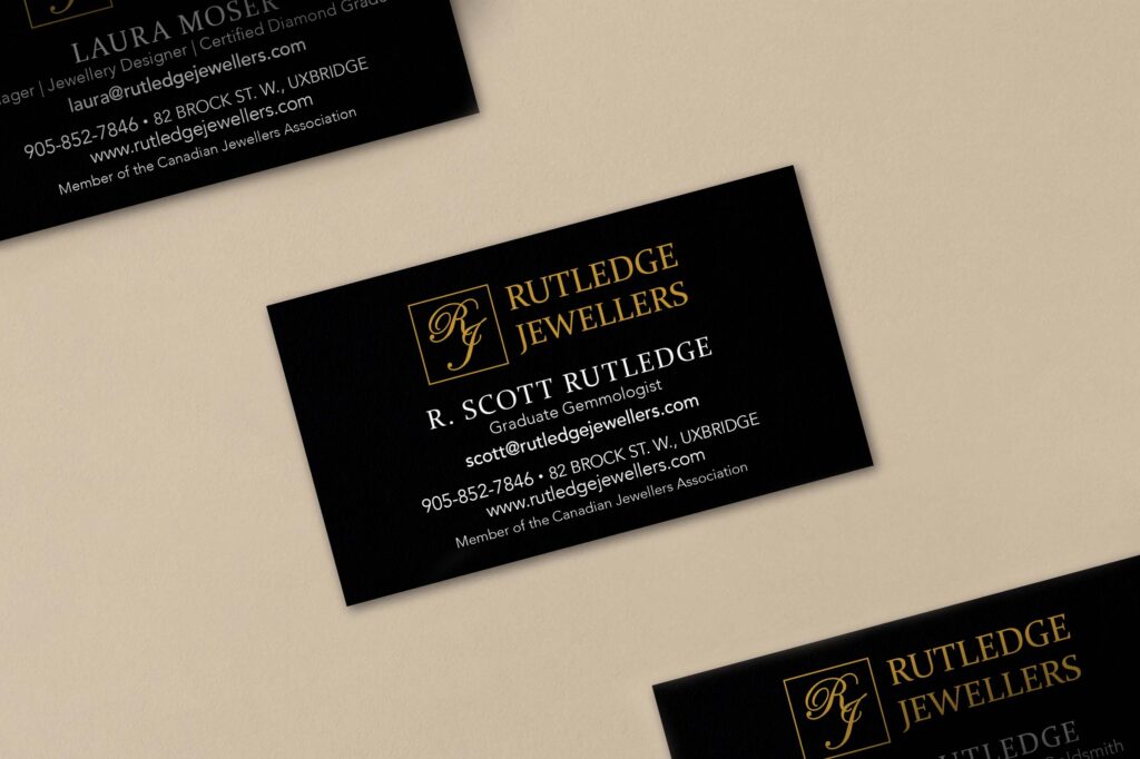
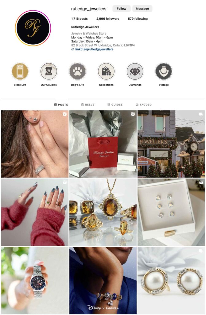
To tackle this rebrand, we looked at what elements of the original logo stand out to customers so we could bring those forward in the new design. We kept the iconic script for the “R” and “J” pulling them together to create a signature icon that can be used as a stand-alone element or together with the full name.
Next, we selected a complimentary font to use for the full name. We wanted something timeless and classic but strong at the same time. Rutledge Jewellers occupies a beautiful heritage building in Uxbridge and immediately outside the store sits a large traditional clock providing a focal point as you enter the downtown core. This nod to the timelessness of past design is reflected in the new logo design.

Want bite-sized boosts for your biz and real wins from real clients? Sign up today!
Call Us
905-852-9031
Email Us
Office Hours
Monday to Friday: 9am-4pm
Accessibility Policy © 2025 Take Root Creative